
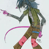
Yeah, I was a little scared to use too dark shadows this time, because I did that in my previous try on something like this, and the result looked a little...propaganda poster-like or something. I think the contrasts between shadows and highlights were too big then, so I still have much to learn.
Sure, if you'd like to give it a go, you're welcome, but I accidently slapped all the layers together in my original picture (which is 5 meg ATM...I'd like to convert it to a JPG though if I should send it over since I'm still on a dial-up connection), so if you want to work on the original, it may be a little hard with all the hair that'd be in the way, but if you'd like the original picture I have to work with, just say so, and I could mail it over or something.
I like the color choices you used here; and your coloring technique is very clean and animationlooking. Nice.
I think the Elvisness is coming from the HIGH contrast of his jetblack hair compared to his relatively pale skin.
Oh, one more thing--from the thumbnail, this looks unfinished because there aren't really any dark shadows on his skin. I think darker shadows would help lessen the Elvis effect of his hair. If you'd like, I could give it a go so you can see what to try out next time.
my art: www.side7.com/art/daniwill