
Thanks much! ^_^ I think the freckles are my favorite part of the image.

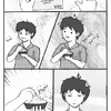
Black and White by @wasabi (Katie C)
After about 2 or three months of no art at all, I finally get the urge to draw something at 1 in the morning! Yay! XD; But I think it turned out good for me not having drawn anything in a while.
I started this image out with pencil and ink, but then my large pen started dying on me so I scanned it in and finished up some of the hair on the computer. I also added the text on the computer, too.
Any comments or suggestions you all have would be great. ^_^
Comments & Critiques (6)
Preferred comment/critique type for this content: Any Kind
Posted: Friday, 09 July, 2004 @ 08:06 PM
Those freckles are great, they really add a lot to this.
I'm afraid you can still see the difference between the black-inked bangs and the flodfilled crown of hair. Selecting all of her black hair (even by the feather) and filling it in will help it blend--in the future, of course. :3 It's still a lovely pic, nevertheless.
Posted: Saturday, 10 July, 2004 @ 02:53 AM
Looking at the thumbnail of this image, I would not have expected her to have freckles, or the feather in her hair. I really like their additions, though, they give her a lot more personality. She's very nicely drawn, the black and white contrast very well in this picture, and I love the mysteriousness of the text - is the question directed to her or is she wondering it herself? The only suggestion I would make is Athena's - when you fill in part of a hand inked picture, you need to make sure the ink scans in solid black and the color you're filling in with is RGB value 0/0/0. Another way to keep your contrast sharp is to scan it in at a high resolution, say 300 or 400 dpi, reduce it to two colors, then restore to full color, and when you save it for the web, resizing with smooth out the lines again. Anyway, lovely picture and I hope to see more from you.
Posted: Saturday, 10 July, 2004 @ 04:15 PM
I think that when I added the text I meant for it to be directed at her, but now that you mention it she does look like she could be wondering about that question, too. I suppose I'll leave it to the viewer to decide. It's easier that way. ^^
Thank you for the scanner tips. I really don't fiddle with the settings that much, but I think I'm going to have to from now on. I'll be sure to refer back to your comment next time I scan another drawing. ^_^
Very nice! I've always been a sucker for simple but pretty black and white pictures. This fits the bill perfectly! I can't really see anything wrong with it, and I love the freckles. Excellent job!