@Jinx
Catherine Fitzsimmons

by @Jinx (Catherine Fitzsimmons)

I don't normally like posting works in progress, but I hope that by doing so I'll get the motivation - or encouragement? - to finish this.

See, I wanted to paint up a quick background after coloring the character and call it done, but now he won't let me. No, he wants to be fighting someone and he wants a decent background, which is much more work than I originally intended of the sketch. I hate it when my characters are demanding.

You know what's funny? Star Wars fanart can go under almost any fanart category on Side 7.

Category:
Rating:
Everyone
Class:
Work-In-Progress
Submitted:
18y205d ago
Tags:
None
Other Work By @Jinx
In These Portfolios

Comments & Critiques (3)

Preferred comment/critique type for this content: Any Kind

Posted: Wednesday, 05 October, 2005 @ 03:41 PM

Wonderful action and detail. The attention you paid to the hair and the lacing in the clothing is really nice :).

There are some anatomical errors, which I wouldn't point out as its obvious you're going for a more stylized approach, but I think they take away from the fluidity of the piece. The major one is his torso, which is about one head-length too short (it makes his legs look like they're growing out of his waist). Also, you've made his collar bones growing into the fronts of his shoulders, they should slope upward and connect at the top, just shy of where the tops of the arm bones connect.

Other than that I think this is a great piece. I'll look forward to seeing it with the background you've been thinking about ^^

Posted: Thursday, 06 October, 2005 @ 01:48 AM

Thanks. I was particularly pleased myself with how the hair came out.

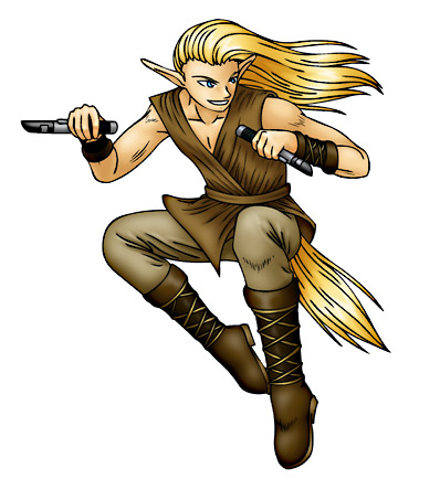
The issue with the torso is that I was going for a little bit of an angle looking down on him down to the waist - perhaps a little evident in the angle of his head against his shoulders - which would explain its squat look. I did actually mean to put some heavier shadows below his chest for that reason to try and emphasize that. I don't know if it will really help very much, as I'm inexperienced with interesting angles as it is, but it's not hard to do, anyway.

Thanks very much for your helpful comments. I see the problem with the collarbone now.

Posted: Thursday, 15 December, 2005 @ 11:51 PM

Side7 just now e-mailed me this comment so I thought I'd reply anyway...hopefully it'll still be helpful/relevant ^^;

Anyway, I think I figured out why the downward angle isn't quite clear. You haven't shown enough of the top of his head so it looks like he's at eye level with you without raising his chin. Also, you're showing too much calf and not enough thigh. I realize that you're trying to show his legs tucked up close to his body, but the fact that the left (our left, his right) leg is at a horizontal angle gives the illusion that the other is at the same level and thus that we're not seeing his knee because it's pointed up, but that we're seeing it because it's pointed forward.

I would reccomend adjusting the leg angles, shortening his calves and giving him a little more forhead--you might want to look at some faces that are looking downward to get a feel for the forshortening there.

But really--nice piece. I hope you finish ^^

Leave a Comment

You must be logged in and have an Active account to leave a comment.
Please, login or sign up for an account.

What kind of comments is Jinx seeking for this piece?

  • Any Kind - Self-explanatory.
  • Casual Comments - Comments of a more social nature.
  • Light Critique - Comments containing constructive suggestions about this work.
  • Heavy Critique - A serious analysis of this work, with emphasis on identifying potential problem areas, good use of technique and skill, and suggestions for potentially improving the work.
Please keep in mind, critiques may highlight both positive and negative aspects of this work, but the main goal is to constructively help the artist to improve in their skills and execution. Be kind, considerate, and polite.