@magenta
Laurel

if only my wings were bigger . . .
if only my wings were bigger . . . by @magenta (Laurel)

Here we have a nice little plump drafter/bluish pegasus. Unfortunately for him, I purposely made his wings too small.. just to make him look funny. :P As you might be able to see, I started to mess around with paintshop pro on one of the legs. I'll eventually want to finish him in psp, and redo some of his wonky hooves (they are really bad), the position of his ears, and a bit of his mane near his wings.

Category:
Rating:
Everyone
Class:
Work-In-Progress
Submitted:
20y143d ago
Tags:
None
Other Work By @magenta

Comments & Critiques (5)

Preferred comment/critique type for this content: Any Kind

Posted: Sunday, 18 January, 2004 @ 04:50 PM

PLEASEPLEASEPLEASE don't smear anything more in Paintshop. Please. I beg you. Your pencil quality is too lovely for that horrible smear tool, dear, and if you want help in digital painting, I'd be GLAD to help, but PLEASE keep the smeartool away from your lovely pencils. I say this because I love you.

In other news, I'm FLOORED by your ability to draw horses in such a realistic manner. You have a way of making them come to life that is really nice--their faces and manes have so much character!

Next time, I'd study wing structure a little more... your horse is so realistic, that your stylized wings just don't seem to mesh together as well as they could--in my opinion, anyway.

Posted: Sunday, 18 January, 2004 @ 08:08 PM

Wow.. I am floored by your comment! Thank you so very much, your work is AMAZING. :)

Anyway.. do you think you could give me some tips in paintshop, if you do have time to spare? I've had paintshop pro for a few years now, but have only really used it to edit real photos.

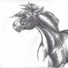
Thanks for the compliment on my horsies.. I do love to draw them. But yes, I DEFINITELY agree with your wing comment. My wings are very bland and not that accurate. So yes, I think I should study them some more.

thanks again, I really appreciate it! :)
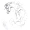
Posted: Monday, 09 February, 2004 @ 05:08 PM

I posted a lot of digital art tutorial links here: http://www.livejournal.com/community/aimeeart/22480.html?thread=94416#t94416

That should get you started.

Talk to you later!

Posted: Monday, 16 February, 2004 @ 05:19 PM

O.O I dunno what to say about this one ... my favourite so far (yes, I am stalkin' your archive ... hehehe)! I love draft-type equines, and this one is no exception. I've never been able to accurately capture the draft build myself, so I really envy you. He looks sort of Welsh Cob to me; very nice. And again with the beautiful head! :) :)

Posted: Monday, 16 February, 2004 @ 06:39 PM

Oooh.. I have a stalker. hehe.. thank you! I'm sure you can get the drafts.. it's all with practice. Before I used to be really into the arabs, but now that I've gotten more realistic I think I'd like a nice calm draft, most likely an andalusian, and therefore draw the drafts. As for the heads go.. I usually draw them first so they are usually the first thing I have to like to make them have a body. (that sounds so cruel.. hah) But I think I should start working with different body positions. Your poses are awesome.. I wish I could do them like you.

Leave a Comment

You must be logged in and have an Active account to leave a comment.
Please, login or sign up for an account.

What kind of comments is magenta seeking for this piece?

  • Any Kind - Self-explanatory.
  • Casual Comments - Comments of a more social nature.
  • Light Critique - Comments containing constructive suggestions about this work.
  • Heavy Critique - A serious analysis of this work, with emphasis on identifying potential problem areas, good use of technique and skill, and suggestions for potentially improving the work.
Please keep in mind, critiques may highlight both positive and negative aspects of this work, but the main goal is to constructively help the artist to improve in their skills and execution. Be kind, considerate, and polite.