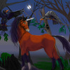
Ohyeah! Forgot -- his eyes aren't focused. Which...lends him this funny debauched look, that's kinda... devious.
Devious looks on easter kittens = FUNNY.
But it's your choice. ;)
@yazzi
Mezz Delf

ok I've pegged this as a work in progress because there's something majorly wrong with the colours. It just doesn't work does it? or DOES it? confused. I've got a baaad cold sneezes. oh and the cat's face is a bit lopsided. I think it's the eyes that are shonky, or maybe the angle of the muzzle
I don't think the cats' colors are too bad at all. I think it's the background that feels out of synch.
Right now, the yellow parts of the cat's fur are a little greenish. I think either (a) you purposely put in the background color into the fur as reflected color (which is a good thing!, only I think the background color kind of clashes), or (b) our eyes are just visually mixing this background color in with the rest of the pic.
In either case, I think you'll have to change the BG color, if you want the cat to be those colors (which go fine together, btw).
Personally, I'd make the purple more "dark"/bolder/richer, but I do tend towards a darker palette than you do ;) (You're more of a Spring, while I'm like an Autumn or Winter.) Do add in some contrast shading later, though.
Anglewise, the eye on the right side of the picture is too far over to the right, in comparison to the left side eye and snout (which match). I do this all the time, it usually just reads as a 3/4 view. A poor 3/4 view, but a 3/4 view, none the less. {:}}
To fix this...either move the right-side eye in more...keep the eyes and change the rest of the head and move the snout over some...
OR...flip the picture horizontally, and try painting it that way (you'll see ALL the proportional errors, I'm very sorry, really, but it is how you fix this sort of thing!).
Also, the cat's bell doesn't quite look metallic yet. But hey, it's a WIP, whaddya expect? ;)
See you later!
Ath