@Anime_Deity
Aline Spyer

kamori-chan
kamori-chan by @Anime_Deity (Aline Spyer)

bleh, this is just my rough draft for something^^ I'm having a little trouble with the right arm's sleve...(your right, her left)...stupid wrinkles... so any suggestions would be GREATLY appriciated!! Once I get the image the way I want it, I'm going to be doing alot with it! (or so I hope)

But anywho, the name of the charactor is Kamori (don't ask about the name, loooonnnggg story) and yes, she is one of my beautiful creations! We might be seeing some Ayaka pics in a couple days, as well^^

NOTE: in real life, the thing is sooo much more clear x.X but it's just a rough sketch, so I guess that it doesn't really matter...

Category:
Rating:
Everyone
Class:
Rough / Concept
Submitted:
20y97d ago
Tags:
None
Other Work By @Anime_Deity

Comments & Critiques (8)

Preferred comment/critique type for this content: Any Kind

Posted: Sunday, 15 February, 2004 @ 05:45 PM

Awesome image idea! As for the sleeve, the wrinkles look fine, it may be the anatomy that's throwing it off. Her upper left arm is a little too long. That's just what I see, if it's supposed to be like that, don't mind me ^_^

Posted: Sunday, 15 February, 2004 @ 06:32 PM

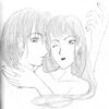
you're very, very right about the arm^^ What happend was that I wanted to make it look as if it were falling down...

eh, it didn't really work that way.

I'm making some other adjustments too. I'll be making little, changes, and doing something to the background...(which I added at the last minute) the background I won't do until the final, though.

Thanks for the comment!!!

Posted: Tuesday, 17 February, 2004 @ 09:27 PM

I tried to post this a few days ago, but the site had a glitch in the matrix or something. Let's see if it goes now. My comment, as follows:

You have a really nice pose going on here, although it has some rough spots to be worked on, and a very interesting composition. It's a little difficult to tell what is going on in some areas, such as the curtains? hanging down in some spots, but I'm positive this is something that will become clear when the image is finished. So I will not critique on that.

The first thing I have to critique on might seem like something odd, but it is... the stairs. They're a really dramatic way to present this character, and I think that's incredibly awesome, but they're very flat the way they are right now. They need to be much more detailed! Try looking at stairs--any stairs--for reference. Note, in particular, that there are more than two lines to make a stair. There are at LEAST three. You have the line of the step above, then the line that starts the actual step, and the line that finishes it (becoming the line of the next step). Make more sense? It takes some time, but I REALLY recommend it, because it will add so much more to this awesome composition.

You did a rather well job putting the wrinkles on the stairs. It's cool to see her skirt pouring over them like a waterfall--very visually stimulating. However, IS this her skirt, or a seperate piece of material she's sitting on? If it is indeed her skirt, I would suggest not making it fall quite so far down. Make the material come to a point, rather than flat edges. I'm not sure if that makes sense, but you have the right kind of idea in the right corner, the way the line of the hem is slanted? IF you like I could do a 'redline' over the image to show you what I mean.

Now, while we're on perspective--that's something else about the stairs. When finding out how big they are going to appear, you need to decide whether you are facing them dead-on, or at a slight upward angle. The rest of the pic seems to be at a dead-on angle, so when you are adding the lines for the actual step part of the stairs, be sure to not make them too big. Otherwise it throws the perspective off. Anyways, what I was meaning to mention is that her skirt shouldn't be visible behind her right leg (her right, not ours!) because of the perspective. Since we're viewing her dead-on, it's unlikely that her skirt would really appear behind her. Again, I'm not sure if I'm making sense. o.O

As for the arm you said you are having issues with, I believe Cybercorn from the message board said it all. The elbow is too far down, but the wrinkles look very nice. I also really like the details you've added to her armband--they look very nice. And the way you have drawm the cloth spilled onto the floor is done VERY WELL. I think the wrinkles on the other arm might need some work--making them bunch up more, you know, like Cybercorn also suggested, I believe.

Another issue I have is with her thigh--her left leg. The way you have the cloth on top of it is slightly awkward--it makes it seem like there is a big dip in her thigh. I think this could be remedied if you would draw the cloth falling over her knee, rather than having her knee on top of it.

And the last thing--her face might be a tad long. And that is everything. I really love the composition, and I am truly impressed with the details you've put into it--her hair is lovely. Her expression is so mysterious, I wonder what she's thinking.

Have you ever seen the artwork of Kinuko Y. Craft? She illustrates the covers for Patricia A. McKillip's fantasy novels (which I adore). For some reason, your art reminds me of hers a little, although hers is much more extravagant and detailed. You should check it out, if you haven't, you might be impressed with what you see.

Anyways, good luck with this image, forgive the obscenely long comment, and I'll be adding you to my museum and looking forward to seeing more of your artwork!

Posted: Friday, 05 March, 2004 @ 07:43 AM

Very good work there. I like the anatomy and proportion, very nicely done. The clothing is nice toom good design and the folds and wrinkles are fine. The linework is very crisp and clear.

Great work!

Posted: Saturday, 06 March, 2004 @ 10:38 AM

Thanks for the comment!! I've done alot of work on this thing (with alot of help from people online and off!) And hope to be posting the lineart soon. Mabye if I get the time i can pfinish it tomorrow...although I doubt it...

Posted: Saturday, 06 March, 2004 @ 12:57 PM

I think this looks brilliant. I found humanoid forms tend to be quite difficult, one of the arms looks a bit longer than the other...but I can't really say much given my last attempt at this.

This idea appears to work quite well and looks extremely good.

Posted: Saturday, 24 April, 2004 @ 04:28 PM

thanks^^ I've posted the new version.

Posted: Monday, 23 August, 2004 @ 10:05 PM

The clear inking is gorgous, and the detail in the dress is really realistic. The only parts that need some good work are probably the face, which is a little lengthy, and the bg. I understand it's a rough drawing, but with a good background it would look amazing. And.. umm... is it possible to put your leg in that angle? ^^;; Looks kind of painful o.o; Awesome picture though, your really talented!

Leave a Comment

You must be logged in and have an Active account to leave a comment.
Please, login or sign up for an account.

What kind of comments is Anime_Deity seeking for this piece?

  • Any Kind - Self-explanatory.
  • Casual Comments - Comments of a more social nature.
  • Light Critique - Comments containing constructive suggestions about this work.
  • Heavy Critique - A serious analysis of this work, with emphasis on identifying potential problem areas, good use of technique and skill, and suggestions for potentially improving the work.
Please keep in mind, critiques may highlight both positive and negative aspects of this work, but the main goal is to constructively help the artist to improve in their skills and execution. Be kind, considerate, and polite.