
KidK, I've got to say, that you've gotten REALLY good at contrast and making things DRAMATIC! I just adore this picture. It packs a powerful sexual-tension punch! And boy is it spooky, too. They look like they want to go for each other's throats in another moment.

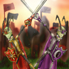
Love Bites by @kidkourage (KidK Mirai)
Pic for the Vampire RP...wonders randomly why it's called that since there are more werethingy than vampire characters in it at the moment...
Anyway. u.u; In this particular universe, AF is the Master vampire of London and Purple is Master of Edinburgh, and for reasons too complicated to go into here, they have both been forced out of their cities. Pur has basically been stalking AF's little group of vampires (who hang out with Bast's weres) since AF reluctantly saved his un-life...and he's basically been getting on everyone's last nerve because he's a total pompous jerk--you know, like most Master vamps are. =D In our last installment, he and AF were literally at each other's throats (it was a 'special moment' u.u), but...but everyone knows that all their fighting is totally going to turn into something else sooner or later. >]
This is gonna be a fun relationship to watch--if only because of all the biting-related jokes I plan on making. u.u
Category:
Rating:
Everyone
Class:
Finished Work
Submitted:
19y90d ago
Tags:
None
Comments & Critiques (4)
Preferred comment/critique type for this content: Any Kind
Posted: Friday, 11 February, 2005 @ 10:30 PM
It's the SHADING, I swear it. XD;; I've been back onto using grayscale and purple layers for shading for a while now, but a lot of the things I've drawn recently have needed to be shading pretty dark due to dim lighting conditions. When the shading's dark, the pic somehow gains another level of drama. It's an odd phenomenon.
Posted: Saturday, 12 February, 2005 @ 11:02 PM
Nah, it makes perfect sense! Elementary art basics. Higher contrast = greater interest, every time. One of the ways higher contrast is achieved is by a larger discrepency between the darks and lights in an area. If you want something to come forward, increase the contrast. If you want it to fade into the background, decrease the contrast. That's why pictures that have only very mild shading aren't very interesting compared to those which have dramatic shading.
Dude o_o Oh DUDE that's... that's HOT. AF's gonna LOVE this! X'D! I want Pur's cape. 6.6 I want it bad.
THEY LOOK SO EVIL! THAT RULES!!