
hmm..youre right the hair needs some highlighting. Think I left it out because the ref.pic was so bad. but Ill try add some.
I`m thinking of trying to draw Johnny when he plays in Pirates of the caribbean. Such a cool character...!
Yes, Johnny is pretty nice:)who knows how many drawings of him will show up...;)

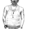
Johnny by @Luinel (Elèn Fauske)
Another portrait of Johnny Depp. Don`t like this as much as the other... His face is a bit out of proportion.
2B-6B pencils.
Category:
Rating:
Everyone
Class:
Finished Work
Submitted:
19y176d ago
Tags:
None
Comments & Critiques (4)
Preferred comment/critique type for this content: Any Kind
Posted: Wednesday, 24 November, 2004 @ 07:16 AM
Posted: Wednesday, 24 November, 2004 @ 07:24 AM
Thank you:) on shading I usually use 4B to 6B, depending on what effect I want. Details F to 2B, 3B. I really can`t give any good tips on this, I only suggest you try out yourself; as my teacher says...;)
Nice drawings of Johnny!! I really want to see the pirates of the caribbean drawing coloured:)It will be pretty nice!
I also like the other one better. You are right, the face is slightly out of proportion. I think that his face is slanted somewhat, but the features are all in neat, horizontal lines, y'know? Also, I think his hair needs some highlights or something. I'm not sure what materials you're working with, though, so I can't really offer any advice on highlighting. But I do hope to see more of these from you. Ah, Johnny... women of all ages agree: he is hot. :)