
100 Palettes Challenge // Palette #9 // Blood Red Hydrangea by @3ofpents
Today's palette comes from a poster for Cornell University from 1908.
This is an interesting one because you can compare it to Cornell's current branding colors.
Babbling about branding and my blood red hydrangea bush under the cut.
You can see all of these colors except for the tan included in that guide, though the RGB/CMYK values are different. For totally understandable reasons. The palette in the book was color-picked directly off of the poster, and on the one hand, the artist who designed the poster would've had to mix their paint or ink to match Cornell's signature red as closely as possible, without having the precision of just digitally color-picking. On the other hand, the poster, like I mentioned, was printed in 1908, and it's entirely possible that the brand colors have shifted and been refined over 100 years later, especially once color printing became more standardized and digital design tools became easier and more popular to use.
But that's really about the red, what they refer to as carnelian. What interests me even more are these secondary colors that appear in this 115 year old poster, that appear in Cornell's present-day brand book.
The "sea grey" (the second-to-last color) I can explain, since the poster is of a baseball player, and the grey is the main color of their uniform and, looking at some photos, it's very similar to their current uniform. And since sports uniform colors are branding, it makes sense that they would've incorporated that into their brand book.
The other two, though? I do wonder if their sense of branding was that strong even in 1908 and it hasn't fundamentally changed in all that time. Or if this poster artist just chose colors that would make that red really pop, and whoever did their current brand book had similar thoughts.
Anyway, that's enough musing on branding. I bring you another flower from my garden.
We planted a baby hydrangea bush when we first moved into this house. When we bought it, it had these dark, rusty, dark red flowers, and the tag claimed that it was a red hydrangea! I love hydrangeas, they were the main flowers in my wedding bouquet, and I desperately wanted a hydrangea bush. And while I love the pink/purple/blue classic hydrangeas, this one was so unusual that I couldn't resist it.
Now it's typical for a newly planted hydrangea to not bloom for a couple of years, so while it grew a lot, we didn't get any flowers. Until this year! There are two little bunches of flowers that just started opening last week.
And they're purple.
Now I'm not disappointed! They're beautiful. And it's not like we paid more for this bush than we would've for a normal bush (they were selling both for the same price). I'm just confused. Because it absolutely DID have red flowers when we bought it and it didn't say anything about special care to keep them that color like you need to do if you want specifically pink, blue, or purple. It's just odd.
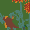
But so I took a picture of the flowers (because they're so pretty!) and since that original red color was so similar to the one in this palette, I decided to redraw them as they might have looked if they'd come in the way they were expected to.
Overall I'm really satisfied with this piece, I really enjoyed playing around with the charcoal pencil brush. I wish I'd treated the tan and dark grey as more shading than an outline. But that's all part of what this challenge is for.

Comments & Critiques (0)
Preferred comment/critique type for this content: Any Kind
Leave a Comment
You must be logged in and have an Active account to leave a comment.
Please, login or sign up for an account.