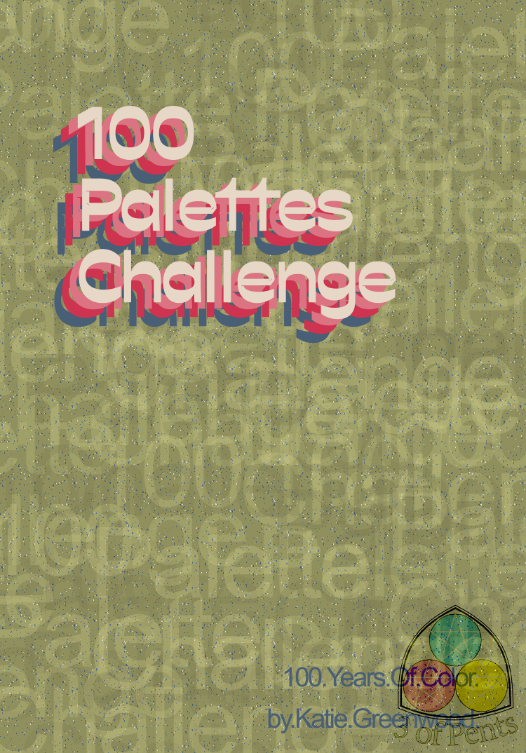
100 Palettes Challenge // Palette #12 // 100 Palettes Challenge Poster by @3ofpents
Today's palette comes from a Viennese ad for a French fashion house from 1911.
I'm kind of genuinely surprised by the number of palettes here that are essentially some variation on the rainbow. It kind of opens your eyes to just how much the specific shade of blue and green and red can change the vibe of a piece. As much as which color you decide to highlight.
I had some actual graphic design work to get done today (Shapeshifters is going to be at Burlington Pride in Burlington, VT on Saturday, September 10th in Battery Park, come by if you're in the area!). So I knew if I was going to get a challenge piece in today it was time to play around with some text-based graphic design, which is generally less time/labor intensive for me. That also led to the decision of taking the obvious route of using the challenge as the subject of the poster.
I made up for those easy routes by not choosing that cream-white as the background color. But honestly that was also because I wanted to play around with this text-as-texture background that I used for the Burlington Pride ad. The text in the Pride ad was neat and legible and all in one color because it was both decorative and sharing information. But here what I did was copy/paste the "100 Palettes Challenge" text over and over in the red, blue, and pink colors; jumbled them all together, layering them on top of each other; set the composite method for each layer to luminosity; then lowered the opacities down around 50%. I really love the way it came out.
Using the sans serif font for the background helped it really fall back and be a neutral background so that the retro serif font really pops.
I'm also super hyped with the retro vibe I was able to get out of this palette from a poster design from 1911. Like, we talk about the cyclical nature of fashion, but we don't really talk about the cyclical nature of design.
Like if you look at some of the psychedelic graphic design of the '60s, and the art nouveau posters of the mid- to late-1800's, you can see the throughline. The focus largely on shoulder-up portraits that are very stylized. The use of swooping, swirling lines as design elements. The kind of playful fonts that are fit to the space rather than just fit into it. The florals motifs. Even the muted, warm-toned colors of the art nouveau style would be carried into the '70s — all those creams, golds, browns, oranges, and olive avocado greens.
I find it so fascinating to see the way these things rhyme. That was what was in my head as I was designing this decidedly '70s-inspired piece using this palette from 1911.
Comments & Critiques (0)
Preferred comment/critique type for this content: Any Kind


Leave a Comment
You must be logged in and have an Active account to leave a comment.
Please, login or sign up for an account.