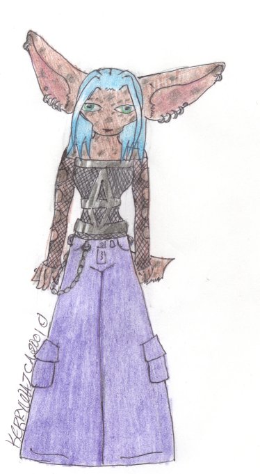
@zodiac
Erin Wajca

Way too light.
Way too light. by @zodiac (Erin Wajca)

i havent been uploading in any paticular order tonight. so, yah. this was either the first.. no it was the second.. second pic i drew of zodiac that wasn't drawn on the computer. the brown came out WAY too light.. and then later on i found the right color.

Category:
Rating:
Everyone
Class:
Finished Work
Submitted:
22y328d ago
Tags:
None
Other Work By @zodiac

Comments & Critiques (0)

Preferred comment/critique type for this content: Any Kind
Leave a Comment

You must be logged in and have an Active account to leave a comment.
Please, login or sign up for an account.

What kind of comments is zodiac seeking for this piece?

  • Any Kind - Self-explanatory.
  • Casual Comments - Comments of a more social nature.
  • Light Critique - Comments containing constructive suggestions about this work.
  • Heavy Critique - A serious analysis of this work, with emphasis on identifying potential problem areas, good use of technique and skill, and suggestions for potentially improving the work.
Please keep in mind, critiques may highlight both positive and negative aspects of this work, but the main goal is to constructively help the artist to improve in their skills and execution. Be kind, considerate, and polite.