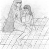
Confused Alexander by @Lucky_Ladybug66 (Daisy Hunt)
Isn't he cute?
I decided not to color this right now because of the texture on the outer side of his wing. All those soft feathers. . . .
Does anyone else think that I made his shirt cling a bit more even than usual? o.o
Category:
Rating:
Everyone
Class:
Rough / Concept
Submitted:
19y95d ago
Tags:
None


LOL! It looks like he's eaten something rather sour. XD!! And yes, his shirt looks a bit tighter than usual, though his pants and sandals look pretty good.
His hands look pretty well done. XP Though many a little . . . boney. The wings are looking better too. I like the new style for the feathers, though I think maybe you should add little edges to each section so they don't get mistaken for leaves. XD; Then he'd be a faerie! Though the extensions on the demon wing certainly look kewl. >3 There's something missing from the edge of demon wing, but I can't picture what . . .
Poor guy. huggles him And the tuff on his head doesn't look veggie like! Yay!