
Thanks! These are really great tips! I can use all the help I can get. :D

I Need Some Help... by @valolove1975 (Tennille Brenner)
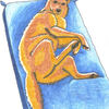
Okay, today I bought some Prismacolor markers. I had a line art from NightWing from the MLP Magic Valley discussion board printed, so I decided to try them out on it. I need some critques here. What have I done wrong? What should I be doing? It sure doesn't look like other art I've seen done with these markers. I know I should have left the areas that needed to be highlighted blank and used a lighter color, but what else have I done wrong? I got some colorless blenders with the markers, but they don't seem to do anything when I try to use them. Thanks.
Comments & Critiques (5)
Preferred comment/critique type for this content: Any Kind
Posted: Saturday, 02 June, 2007 @ 03:24 AM
Work FAST. That's the biggest tip anyone ever gave me. Makes things a lot smoother.
For my detail shading, I use Prismacolor pencil for the detail work.
It take a lot of practice, and finding the right paper can be a pain sometimes. If you find you have too much bleed, keep some spare paper around and blot the markers a bit before you use them.
Posted: Saturday, 02 June, 2007 @ 11:46 AM
The other commenters have given excellent advice and I can only echo them and stress the important of layering with the markers. If you'll look at this image I did with Prismacolor markers:
http://www.side7.com/cgi-bin/S7SDB/Display.pl?act=image&iid=326769
I only used one marker per area in each part of the picture. You can get some really nice shading just layering the same colour over itself. As for the blender, I find it also works well for highlights, especially with darker colours. An example in which I used this (and I apologize for the self-promotion):
http://www.side7.com/cgi-bin/S7SDB/Display.pl?act=image&iid=324353
And, as always, the main key is practice, practice, practice. Markers are challenging because you don't get much opportunity to correct mistakes, but you can get used to them.
There were also two excellent tutorials on using markers that really helped me:
http://elfwood.lysator.liu.se/farp/markers2/
http://neondragonart.com/dp/tutorials/marker.htm
All that said, you're off to a great start here. The cel style shading does work nicely in this picture and the shadows are in the right places. Good luck!
well, I'm by no means a prisma-wizard, but I spotted some stuff that you might want to work on. the one thing I see is that the shading looks very harsh against the main color of the skin. I see you tried to blend the two together, but it doesn't help much, because of the differences in color. what I suggest is lay down the shading like you've done already, and then do another layer of your skin color (the lighter blue) between the skin and the shading. what happens is the more you layer the color, the darker it becomes. this would work better for the body, because you used a much darker shade than the skin, so it looks really stark. to make it look more interesting, I'd also suggest adding a darker shade to the shaded area, and make it a three color deal, the light blue, the shaded blue, and then another, darker blue. I like what you did with the tail/hair. you had the right idea leaving the highlites uncolored. but remember, the skin has highlites too. try using that technique on the body as well. what I also like about the tail is that the shading is very smooth and natural. it's not harsh like the skin. you did a nice job on that. anyway, that's just some basics. to shake things up, try mixing in different colors that you wouldn't normally use, or create a new color by adding colors on top of each other. oh! and about the colorless blender, essentially, it's a marker without pigment. it's designed to help smooth rough edges (but to me, it doesn't help much, unless you have paper that bleeds easilly. the extra moisture from the blender would help smooth it out, but you'll really only notice it with colors that are similar to each other. your two blues are too different for the blender to do much.) what I suggest is finding colors that are really close to each other in shade, and just layer them. you'll get a nice soft shade with that, and it'll look more natural.