

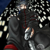
First thing I thought was that the knight looks like one of the character from Lodoss War. Not a bad thing. My compliments on his armor. Looks like you thought out everything you put on him. And the rest of the pic...props for all that detailing. It looks good.
Only critique--with the every bit of the knight tinted red, it looks like he's from a completely different picture than the princess and the background... (That or he is an Apache knight with bronze armor. Heh.)
The background is great! The shading is great for markers. The transition in colors is so smooth and unnoticeable..