@Leia
Leia Michaels

Anew - Bri and Nate - Descent
Anew - Bri and Nate - Descent by @Leia (Leia Michaels)

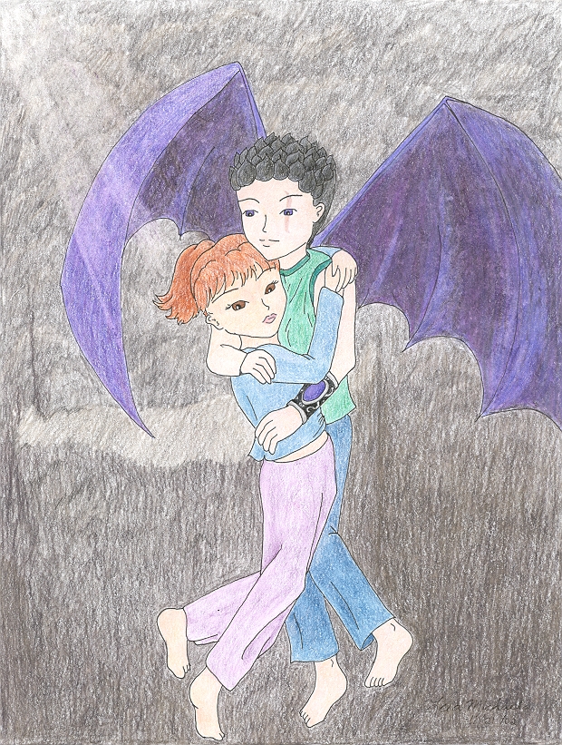
Hmm, Bri doesn't quite look like she trusts Nate carrying her down into a mountain... ~grin~ I like the composition of this picture, but there are some things that are bugging me.

Mainly, Nate's right hand. I totally slipped when I was tracing it, then tried to fix it, and... yeah. :) But it's not so bad. Nate's wings are a touch uneven, and I think they might be too light, but I'll let his mun decide that. And Nate looks too serene and quietly happy, but since he's carrying Bri... ~laugh~

Okay, nitpicks on Bri... she's too light, her expression isn't as good as it was in the sketch, and she looks like she borrowed Risa's clothes. ^-^ The colors are too pastel for our tough-chick.

And the background... ~laugh~ I know it's not anything, and the sad part is how much time it took me to do it. -.-'

But I'm still happy with this one; it's cute. :)

Artwork © Copyright 2002 Leia Michaels
Category:
Rating:
Everyone
Class:
Finished Work
Submitted:
22y7d ago
Tags:
None
Other Work By @Leia

Comments & Critiques (3)

Preferred comment/critique type for this content: Any Kind

Posted: Friday, 22 November, 2002 @ 06:39 PM

"Why did I let him talk me into this?" chuckles Her expression is classic.

I like the way you did the lighting from the side to brighten things up a bit - I think it fits in well, given the little hole that let them into the mountain to begin with. Don't think Nate's hand is in bad shape, either. :) His wings might be a touch darker, but not a lot, I think. Then again, that's what I get for not drawing them first... ;) Or at least picking a definite color.

Hm... those do look like Risa's clothes, don't they? :) Maybe Bri decided to stand out a little for the day... j/k

Nicely done, even if the background wasn't as nice as you'd hoped. :) I'll hush now and let someone else talk... no, really...

Posted: Saturday, 23 November, 2002 @ 03:36 PM

Oooo, you finished it ^^ I likes. Especially Bri's expression! And I don't think Nate looks too serene. I mean, really, he gets to carry Bri, I think he looks just smug enough ;-)

I agree with Dale, the light coming from the corner looks really cool. How'd you do that? O.o I also like how you're experimenting with wrinkles. Wrinkles are fun! ^^

Keep up the good work, sweetie.

Posted: Friday, 21 March, 2003 @ 12:18 PM

I know I answered your question elsewhere, Gail-chan, but just in case anyone else wants to know-- it's eraser. ~chuckle~ Lightly drag a white eraser (Not a gum eraser or a regular pencil eraser, but one of the markless kinds... like a quick-click eraser) to make streaks where sunlight could be shining through. That's it. :)

Leave a Comment

You must be logged in and have an Active account to leave a comment.
Please, login or sign up for an account.

What kind of comments is Leia seeking for this piece?

  • Any Kind - Self-explanatory.
  • Casual Comments - Comments of a more social nature.
  • Light Critique - Comments containing constructive suggestions about this work.
  • Heavy Critique - A serious analysis of this work, with emphasis on identifying potential problem areas, good use of technique and skill, and suggestions for potentially improving the work.
Please keep in mind, critiques may highlight both positive and negative aspects of this work, but the main goal is to constructively help the artist to improve in their skills and execution. Be kind, considerate, and polite.