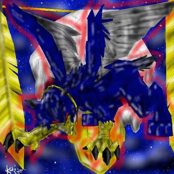
thanks for the tips... well, first off, I used an oekaki board, so that was difficult in itself... X.x ... and then my mouse started to mess up, (it was kind of sticking when i moved it), so that made the coloring REALLY hard. I kind of just gave up after a while and saved it. sigh I have very little patience.... oh, and the line art was fine, it's just the coloring screwed it up.. O.o ... X.x ... oh well... Thank you, though, for your critisism. (and thanks for not making it a flame. ^^ ) .. i appreciate it. :) ...

Gryphon by @Kachie_Runa (Katie Luna)
This is one part of an art trade. (i'm going to draw 2 pics and trade them for two of the other person's pics) C&C please! ^^
Category:
Rating:
Everyone
Class:
Finished Work
Submitted:
20y109d ago
Tags:
None
Comments & Critiques (3)
Preferred comment/critique type for this content: Any Kind


Well first of all, i suck at using computer programmes for drawing. the first comment i have is on the contours, they should be drawn more clearly so you can see where, per example, the legs start. Second, i don't know if you've done so but i'm just commenting, try to make a drawing of it and use that as a basis (don't know if it works). And last, the lighting, if it was meant to be in front of the gryphon you've done very well, but if it was meant to be from above you should think of a 3D pic of it (in your mind, of course)and put the lighter colouring on the raised surfaces.
but you've done a great job using little complicated means (i think). hope to see more from your hand.