Have a nice trip? by @ManekiNeko (Jess Ragan)
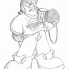
I was experimenting with poses and gestures when I drew this picture of Byron, putting his wrong foot forward and nearly falling on his face as a result.
Category:
Rating:
Everyone
Class:
Undefined
Submitted:
21y84d ago
Tags:
None


It's good that you're playing with motion...I think more artists need to do so. However, this isn't quite there yet, but you have the right idea.
If someone's almost going to fall, their weight isn't going to look really well distributed. And their arms will be flayling, and they probably won't look so "in control" of their body. Have a look at some 2D animation art, learn about the Line of Motion (drawn before any of the character is), and how to make things look unbalanced, using arcs.
Hint: When the head is right over a point of support (a foot, or an arm, if he's leaning on something), he'll look balanced, in control. The further you move the head (and rest of the body) away from a point of support, the less balanced they'll look--and they'll seem like they're falling or moving.
Hope that helps! Keep up the experimenting!