@Hoverlight
Alexandra Brandt

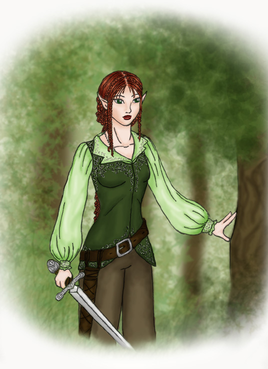
Althea in the woods
Althea in the woods by @Hoverlight (Alexandra Brandt)

So - my final colring job of a drawing of my sister's elven character, Althea Dumanios. This was so much fun - especially the background. I had to make a couple changes, particularly the embroidery which is now silver, because my sister corrected me in that matter. So now Althea looks as she ought, and I fixed the sword and made it look better. Although now that I look at it, I think I put the scabbard on the wrong side. Whoops.

Category:
Rating:
Everyone
Class:
Finished Work
Submitted:
20y297d ago
Tags:
None
Other Work By @Hoverlight

Comments & Critiques (3)

Preferred comment/critique type for this content: Any Kind

Posted: Monday, 02 February, 2004 @ 11:47 AM

Oh wow, it's absolutely beautiful!!! I'm jealous...hehe.

Posted: Tuesday, 03 February, 2004 @ 11:25 AM

Ack! Curly hair! evil....

Okay, now that that is out of my system, looks pretty nice. The hair looks good (I just don't like drawing hair like that) the embroidery is very nice, and props for the sword details and for at least thinking about how the scabbard is connected to the belt. And the background is kinda nice. Was that photoshop, or some sort of sponge painting or something?

A few minor quibbles with the anatomy though. The girl's right ear (our left) looks a bit low--compared to the eyes and the other ear. And the arms looks a little squiggly. Her right wrist is tiny. And the other arm....The way its posed makes it seem like the elbow should be pushing the fabric out somewhere.

But quibbles aside, it is a very well done composition.
Posted: Tuesday, 03 February, 2004 @ 07:14 PM

Guess I must have done a worse job on the hair than I thought - it's actually supposed to be a super intricate braid made up of lots of tiny braids. Her hair is actually pretty straight, not curly. Whoops!

Yeah, I've been experimenting with Photoshop recently - the leaves are actually three different brushes, all blurred together.

One of the things I need to work on most are ears - I suck, especially when it comes to positioning. Thanks for the advice. Yes, and I wasn't altogether pleased with the sleeves of her shirt - I can see where you would think her arms are squiggly or something.

Leave a Comment

You must be logged in and have an Active account to leave a comment.
Please, login or sign up for an account.

What kind of comments is Hoverlight seeking for this piece?

  • Any Kind - Self-explanatory.
  • Casual Comments - Comments of a more social nature.
  • Light Critique - Comments containing constructive suggestions about this work.
  • Heavy Critique - A serious analysis of this work, with emphasis on identifying potential problem areas, good use of technique and skill, and suggestions for potentially improving the work.
Please keep in mind, critiques may highlight both positive and negative aspects of this work, but the main goal is to constructively help the artist to improve in their skills and execution. Be kind, considerate, and polite.