@MadameHotaru
Sam Powell

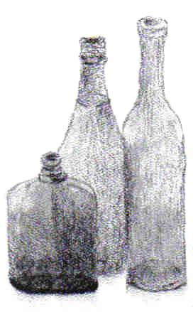
Bottles
Bottles by @MadameHotaru (Sam Powell)

Everybody needs to practice on something still lol. This is what I chose for a motif. On paper the image has an additional bottle but I cropped it out due to its unfinished/rough look. This drawing is one that I'd really like to see comments concerning technical aspects on. Porportion, shading, etc.
Category:
Rating:
Everyone
Class:
Finished Work
Submitted:
20y231d ago
Tags:
None
Other Work By @MadameHotaru

Comments & Critiques (1)

Preferred comment/critique type for this content: Any Kind

Posted: Saturday, 10 April, 2004 @ 07:37 PM

I really think the two taller bottles look great, and the shorter one does too, but it could use a more rounded bottom. Otherwise, cool! I don't want to comment on the shading, because I know it looks different on paper than it does on my moniter, but it looks pretty good to me, exept the bottom of the shortest bottle looks a bit too dark. But again, it could just be the computer. All in all, I think you've done a really great job! ^_^

Leave a Comment

You must be logged in and have an Active account to leave a comment.
Please, login or sign up for an account.

What kind of comments is MadameHotaru seeking for this piece?

  • Any Kind - Self-explanatory.
  • Casual Comments - Comments of a more social nature.
  • Light Critique - Comments containing constructive suggestions about this work.
  • Heavy Critique - A serious analysis of this work, with emphasis on identifying potential problem areas, good use of technique and skill, and suggestions for potentially improving the work.
Please keep in mind, critiques may highlight both positive and negative aspects of this work, but the main goal is to constructively help the artist to improve in their skills and execution. Be kind, considerate, and polite.