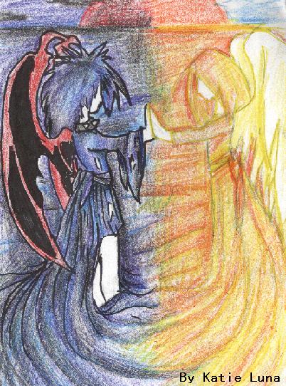
Very nice! You seem to have a theme going here, with the blending of opposites, and it's very, very nice. You use colored pencils really well, I like the textured feel. Scans really do kill contrast with pencils for some reason. Programs like Adobe can fix that, along with the jpeg and other 'noise' that clouds images. So I'd look into getting one of them. One critique, however, is that the black outlines on the dark ones really make the light one's outlines seem very faded. Maybe a red or even white (if you can find a decent white pen/marker, I myself have had a heck of a time finding some so I can't even recommend any) outlines would be better. Or you could try going over the outlines in the computer. :) Well, keep up the great work!

Dark and Light by @Kachie_Runa (Katie Luna)
An idea I got when I was listening to music. My friend said it reminded her of Kachie and Hekele from Lethal Vengeance. (A story I made) Hekele being the light side and Kachie being the dark side. So I guess I'll use it for the story. :) The shading looked alot better before I scanned it though...
~:: Kachie ::~
Comments & Critiques (3)
Preferred comment/critique type for this content: Any Kind


I like how you did the colour choices and the blending between the two ^-^ very nifty.