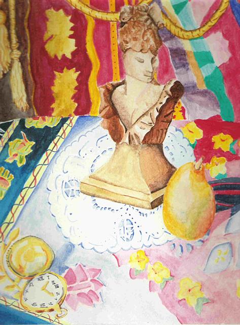
I'm glad you like it. I was trying to go for something different. The colors weren't supposed to be so bright, but when I first started with the the drapes in the back I found I didn't like the look of the colors being so dull, so I brightend them up a bit. :) I think it turned out much better than it would have if I didn't. I thank you greatly for the comment. =D

.JPG)


I really like the sense of colors and patterns in this. It's interesting to see a sienna brown statue--kind of classic--put in front of these very fun, bright patterns.