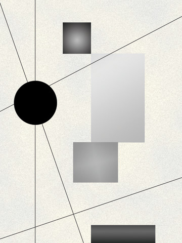
Dog on a Tricycle by @JesterAG (Al Gonzalez)
The first of a series of five painting drafts called "We're Better Than You."
Basically, this is my stab at 'modern' art.
Ever wonder how a bunch of bricks piled in the middle of a room is special? How abot a canvas full of black paint? What about all of those squares that look like kitchen tile, but are supposed to 'clearly' represent a human figure?
Well, after taking a Modern Art class, (a bad one) I've come up with one answer. Art society thinks it's better than everyone else. So here you go, enjoy part one of five.


Totally agreed...modern art can be so pompous sometimes. I still like this though, because the image itself is pretty. Simple, yet cool. :D Even if modern art HAS meaning behind it (which not everyone besides the artist would realize), art isn't ENTIRELY about meaning...it's also there to be pretty too! :)