@Outlaw
Kaleigh Bulford

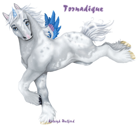
Tornadique
Tornadique by @Outlaw (Kaleigh Bulford)

This is my newest unicorn/pegasus character, Tornadique (Toar-nah-deek). She's a young french bred filly. She can't fly yet and I'm not sure about keeping the wings. She's based on a thoroughbred/percheron cross.

Work in Progress because I'd like to do a background if I can find any spare time.

Category:
Rating:
Everyone
Class:
Work-In-Progress
Submitted:
21y109d ago
Tags:
None
Other Work By @Outlaw

Comments & Critiques (4)

Preferred comment/critique type for this content: Any Kind

Posted: Monday, 11 August, 2003 @ 05:58 PM

AWW! This is so cute! I love the way you colored it and the anatomy. Realistic and yet not all at the same time.

Posted: Monday, 11 August, 2003 @ 06:21 PM

First of all, excellent, EXCELLENT job on the coloring and anatomy. This character looks supersolid, and very beautiful! Your choice of colors really works well, too, and the motion is very well-done.

I have some other notes, too. First of all, the wings look really pasted on, and pixely. If it were me doing this piece, I'd leave them off.

Second, you see how her black hoof just touches the front edge of her front leg? That's a tangent, and it makes it look like the black hoof is stuck to the leg. Either moving the hoof towards the rear more (so it looks like it overlaps the far leg) or pulling the hoof forward (so we see whitespace between the hoof and leg) will solve this problem.

I also notice in some places the character isn't entrely 3D. If you compare the chest, and the two legs, it doesn't look like the chest is very deep, which makes the front legs seem like paper cutouts. Showing the far back leg's knee also makes it look like her body has no roundness (instead of being like a sausage, it gives a feel of a paper cutout).

Finally, I'd like to see more structure on the face--especially the nose, which looks a tad flat.

Eh, I know that sounds like a lot, but it really isn't; just remember to think in 3D, and study up on horse faces a tad more.

Did I mention I like the shapes in the tail? Good stuff, man. You're an excellent artist!
Posted: Monday, 11 August, 2003 @ 06:59 PM

Damn girl, that is quite possibly the most useful critique I've ever gotten (though can't say I agree with you on everything) most people just say 'oh, thats good'. Mostly the anatomy is off (such as the head) because I based it on the Spirit movie style. The other major problems are me getting totally bored of shading (chest, computer crashed the first time I did it) Thanks for the crit, it helps a lot ^__^

Posted: Monday, 18 August, 2003 @ 02:25 PM

I'd say that the coloring/anatomy is just brilliant! :D But yes, I half-agree with ASAthena. And yes, the wings look as if they were just pasted on...if you decide to delete them, I shall remove mine from my half of our art trade. ^-^ Happy drawing!

Leave a Comment

You must be logged in and have an Active account to leave a comment.
Please, login or sign up for an account.

What kind of comments is Outlaw seeking for this piece?

  • Any Kind - Self-explanatory.
  • Casual Comments - Comments of a more social nature.
  • Light Critique - Comments containing constructive suggestions about this work.
  • Heavy Critique - A serious analysis of this work, with emphasis on identifying potential problem areas, good use of technique and skill, and suggestions for potentially improving the work.
Please keep in mind, critiques may highlight both positive and negative aspects of this work, but the main goal is to constructively help the artist to improve in their skills and execution. Be kind, considerate, and polite.