

Thanks so much for all the tips! You're the first person who's given me a comment! Mmm... I'm not sure about the horse size, because I was actually trying to make him small compared to the rider, but I don't know anything about horse anatomy or riding for the saddle positioning. I got the "canter" pose from looking at an old drawing book.
As for shading, the problem is a little of both. Usually I guess where I think the shadows should go and move them around until they fit. I have Paint Shop Pro 7 and Adobe Photoshop Elements, which sadly does not have the pen tool. PSP has a freehand tool that smooths out mouse/tablet drawn lines so I used that, but it makes it hard to get a sense of the picture as a whole while I'm shading.
BTW, I checked out your gallery the shading is very smooth and impressive! Thanks for the input and I'll try looking at more anime for reference.
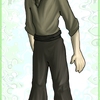
Cute picture. I like the movement in the figures and some of the shading came out rather nicely, particularly the guy's clothes and Seabiscuit's tail. He's rather a bit big for the horse, but considering where you placed the stirrup, that may have been intentional. A background would do this picture well.
As for the cel style shading, which do you need help with, placing the shadows or the technique to make them? If you need help deciding what parts to shade/highlight, the best thing to do is practice. To help you along, try studying still images or official art from various anime, or you can take a photograph, digital or scanned, and decrease it to 256 colors, standard palette. Not all photos will convert to show you shadows well, so don't be discouraged if it doesn't work at first, but when you find a good one, study the light source and where the highlights and shadows stop in relation to it.
For the technique, if you have a recent version of Adobe Photoshop, the easiest tool to make smooth, solid cel style shading is the pen tool. I like to use the freehand pen tool, which takes the lines you draw as if you're selecting an area freehand and converts them to a smooth-outlined work path. You can then go to the Paths tab of the Layers/Channels/Paths window, right-click your set path, and choose Fill Path to fill in your highlights/shadows. If you don't have access to a pen tool, it's a little more work, but you can freehand select the area to fill in your shadows/highlights and flood fill the area with the desired color. This often results in having to clean up the lines by hand a little bit, but it works.
Hope that helps you. If you need me to elaborate, just let me know.