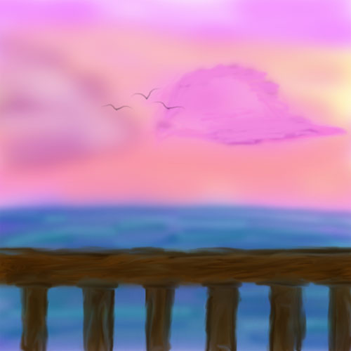
Horizon by @Jansu (Brandon Ballenger)
Another background type image I've been playing with. Though what I would put in the foreground, I don't know.
I seem to do a lot of backgrounds. And a lot of horizons.
@Jansu
Brandon Ballenger

Another background type image I've been playing with. Though what I would put in the foreground, I don't know.
I seem to do a lot of backgrounds. And a lot of horizons.
Comments & Critiques (4)
Preferred comment/critique type for this content: Any Kind
Leave a Reply
You must be logged in and have an Active account to leave a comment.
Please, login or sign up for an account.
Nothing wrong with lots of horizons or backgrounds, and I honestly think that this picture doesn't need a foreground, or if it had one, it wouldn't be the main focus of the drawing... Maybe someone standing off to the side looking out at the ocean...
The birds really do seem like they're real... And the colors make for a really pretty sunset-time background... Purty!
Leave a Reply
You must be logged in and have an Active account to leave a comment.
Please, login or sign up for an account.
Oooh, pretty airbrushing, Janus! The colors are just beautiful, you did a great job selecting different colors to mix together for a very atmospheric effect. The yellows & pinks of the sky are particularly lovely, and the sea looks wonderful against the sky. The birds are simple and well done, and the railing really gives the image a sense of location. At first I was thinking of a boardwalk, but after looking for a while it seemed more like a balcony on an upper story of a building. I think part of that sense of height comes from the curved horizon (great touch!) The pinkish cloud on the right looks a little odd b/c it's in much sharper focus than the rest of the picture. Softening it up a bit might look better. Lovely work, Janus! =D
Yup, I intended it to be kind of higher up. I haven't really had the opportunity to do that on a beach, never higher than a second story or so I should say. I ended up lowering the railing by maybe as much as an inch, just because it seemed to high to me.
The sharper cloud was purposeful too, I just wanted to try two different ways of doing it, and I left it alone. But you're right, it doesn't really fit in.
Thanks. :)
Leave a Reply
You must be logged in and have an Active account to leave a comment.
Please, login or sign up for an account.