by @ZombieCat (Nick Bliss)
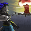
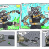
I printed out the last version of this, did a graphite transfer, made some changes, rendered it in real ink (as opposed to CGI), and sent it in as one of the pieces for my final portfolio project. It scored an A+, so I guess someone must have liked it.
Category:
Rating:
Everyone
Class:
Finished Work
Submitted:
19y40d ago
Tags:
None


Yeah, I like the bold style of this :)
Nice use of both light and dark lines
the shadow is cool too :)
Good beans!