@Lady_Amberjo
Lady Amberjo

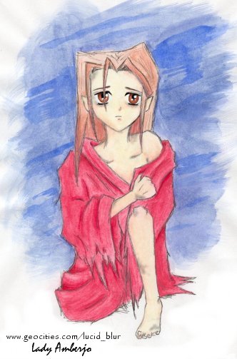
Experimental Watercolor Azelma
Experimental Watercolor Azelma by @Lady_Amberjo (Lady Amberjo)

please do not post or use image elsewhere

Very, very old sketchy little thing I doodled on a sick day, purely out of desire to play with my new Creta watercolors. Probably wasn't the best idea to use computer paper to watercolor with, but it didn't turn out too badly, considering.

Anyway, it's Azelma. Poor little waif. It's not fun to be one of the lone survivors of the book. Especially when you're stuck with Thenardier. And that's supposed to be Enjolras' flag she's all wrapped up in, by the way.

I do intend to redo this one at some point, as I like the idea, but I'm still fond of this little scribble...look, mummy, I can do full-body poses!

Category:
Rating:
Everyone
Class:
Undefined
Submitted:
19y142d ago
Tags:
None
Other Work By @Lady_Amberjo

Comments & Critiques (6)

Preferred comment/critique type for this content: Any Kind

Posted: Friday, 08 July, 2005 @ 01:58 AM

This is rather pretty, and I'm still so fond of her expression. She seems so vaguely sad, poor thing. pats her I like the frayed-ness of her flag-garment, and the proportions seem pretty good. At first I though the shown hand/arm was a bit small, but if she is a starving little thing, then it might be normal.

Her feet have toenails! ^_^; I like that random detail. Her eyes also look really clear, and pretty, but it's a little odd, since they look clearer than the rest of the pencil. Her slightly-pointed ears are cute.

Posted: Friday, 08 July, 2005 @ 02:07 AM

snicker The proportions are probably horribly off...it was a very quick doodle-thingy, but it's a doodle-thingy that makes me smile ^_^...in a sad way, I mean...poor Azelma...and actually, is she were starving, her hand would probably look really big in comparison to her wrist...but ah well, I'm sure she doesn't mind. She's got bigger things to worry about ^^;

Heh, I'm not surprised that the eyes look too clear...I cleaned them up in Paint Shop Pro, and over-defined them...but even over-defied, it's an improvement over how they looked before...
Posted: Friday, 08 July, 2005 @ 09:52 AM

My first thought upon seeing this was that she looked a little like Shizuka. ^^;;

She does look adorable for such a sad looking child. Siren was right when she said the little details bring it out. The folds and the tattered edges really give the flag a shabby appearance and even if you don't know what has happened, you get the feeling that it was something bad if her eyes weren't enough to tell one that fact.

Watercolors are fun to use! Isn't it odd that on days when you do little doodles with not much direction, that they turn out to be some of your favorites? ^_^

Posted: Saturday, 09 July, 2005 @ 01:01 AM

Heh, the person who scanned her for me thought she looked like Shizuka, too ^_^; Next time I draw her she'll look less...Shizu-esque...

pokes the tattered edges Huzzah for dramatic gunfire! That which wounds characters and beats up flags to artistic frizzies!...and yes, it's very odd that the casual doodles come out so likeable...methinks it's the lack of stress involved in the creating...

snuggles

Posted: Friday, 15 July, 2005 @ 05:13 AM

Yes, it does have a resemblance to Shizuka. XD; And the ears look slightly elfish. ^^; But neither thing detracts from the picture at all. She looks so sad and lonely.

I think my favorite thing here is the torn flag. It's shaded brilliantly, and with watercolors. Wow. could never get watercolors to cooperate with her. I also really like how the leg came out.

Posted: Sunday, 17 July, 2005 @ 01:06 AM

Hee, the watercolors I use are Creta pencils, which make everything remarkably easy, so the shading's actually not that impressive (thanks, though XD)...if you can shade at all, you can shade with those suckers, paint or no...they're much, much more effective than a standard watercolored pencil...these things are like really stiff brushes...

Leave a Comment

You must be logged in and have an Active account to leave a comment.
Please, login or sign up for an account.

What kind of comments is Lady_Amberjo seeking for this piece?

  • Any Kind - Self-explanatory.
  • Casual Comments - Comments of a more social nature.
  • Light Critique - Comments containing constructive suggestions about this work.
  • Heavy Critique - A serious analysis of this work, with emphasis on identifying potential problem areas, good use of technique and skill, and suggestions for potentially improving the work.
Please keep in mind, critiques may highlight both positive and negative aspects of this work, but the main goal is to constructively help the artist to improve in their skills and execution. Be kind, considerate, and polite.