Aww, thank you so much! :) I know there's some things I could have done to make the fire even better, but I really am proud of how it came out here. My other fires look just awful.

Infernal by @Lucky_Ladybug66 (Daisy Hunt)
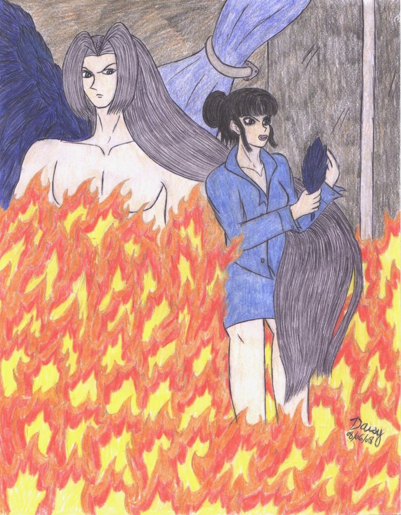
From chapter 5 of God Help the Outcasts, highly symbolic. Kala-Ansa is holding the feather that dropped from one of Seph's wings, thinking of him as the flames of lust spill over in her heart. Seph's hair flying around her is more symbolism, showing how she believes him to be responsible for her feelings, as well as just showing more that she's lusting over him. I wish I could have gotten Seph more transparent, to show that he's a background figure in her mind.
When I started coloring, I took Ladyamberjo's suggestion of not inking the fire. I think it turned out pretty well. X3 I also tried to mix fire colors in with the wall and the glass doors. Kala-Ansa's face is dark for two reasons: more fire light, and I had an accident with the eraser. I had another accident in that I forgot her blouse was supposed to be white. -.-;
Comments & Critiques (4)
Preferred comment/critique type for this content: Any Kind
I'm always totally thrilled when somebody actually takes my advice. ^__^ I'm glad it helped!
Transparency with colored pencils is hard, especially if you're doing the original outlines in graphite...it smudges too easily do do any fun layering with. I usually go with monochrome for background figures ...same idea, different effect.
...even if her blouse was supposed to be white, it looks good blue. It stands out well against the warm colors of the fire. And your fire's definitely improving! One thing I noticed, though, is that you seem to have one basic flame-shape throughout the picture...next time, it might help to alter the shapes and sizes a little more. Still, it's very nice fire!
The sweep of the hair is very nice, and I like the way she's holding the feather, stroking it with her other hand.


Wow! This picture is sure hot and fired up with awesome! The fire is certainly without a doubt great, you did great on taking that suggestion; it's very realistic! :)
I know what you mean about wanting to make Sephiroth transparent, I kinda should have made Emerl transparent too in that Cream picture, but oh well! Either way, I think your picture turn out excelent! Great work! ^_~