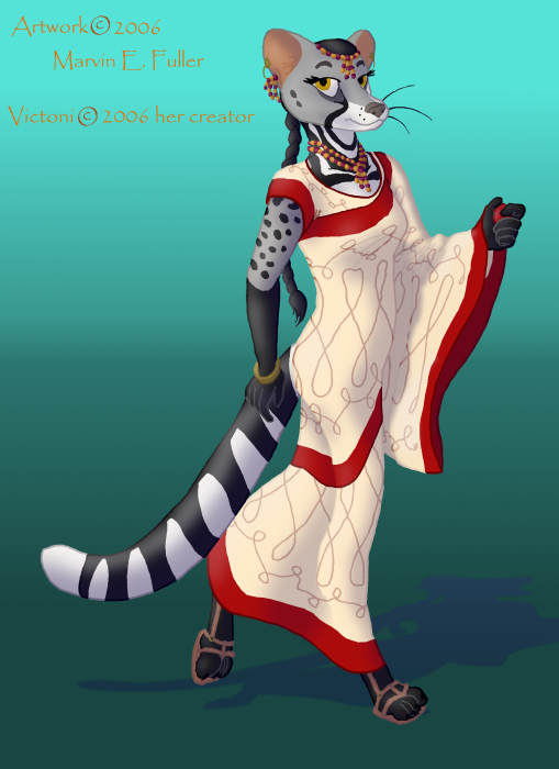
Thank you for your comments. Normally, I don't go so far as to shade my pictures as it's still a lot of effort for me, but I like to get it right when I do try it. Your suggestion about the whiskers is a good one, I think. Normally, I prefer to leave off the near whiskers because I think it makes the face look too busy. Most likely, I would foreshorten the far whiskers more if not take your suggestion and leave them off.

Victoni by @Roadstripe (CyberCorn Entropic)
The first civet I ever drew. Victoni was the character of a player on Furcadia.
Artwork © 2006 Marvin E. Fuller Victoni © 2006 her creator. Sadly, I don't know her name.
Category:
Rating:
Everyone
Class:
Finished Work
Submitted:
17y128d ago
Tags:
None
In These Portfolios


Striking piece! You've done a great job with this piece... great linework (and I love that you removed from the cartoony style by reducing your actual lines), lovely colour with good higlights and shading, and a wonderful and ACCURATE shadow. For your first civet, you've done very will with the markings and structure. The only suggestion would be to either: add visible whiskers to the right (our left) side of the face, or remove the whiskers completely... the dots symbolizing where the whiskers would be looks fine, as do the whiskers, but the angle the head is at does not match how you have one and the other.
thumbs up
Kona Dragon <3