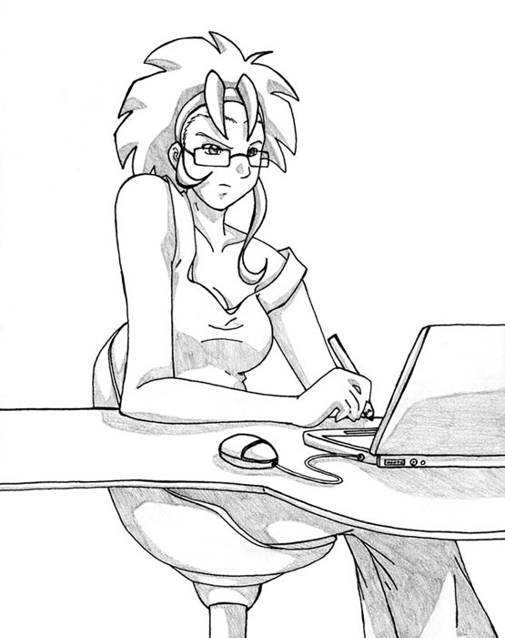
The pose is really freaking awesome. I love how well drawn the accessories are, too. And her shirt and glasses. Geez. There is absolutely nothing bad with this picture! It's perfect!

banana by @alienfirst (Amanda Lien)
I've owed Ayame a picture for a long time now, so I finally decided to get something done. After trying (and failing) to make up an interesting pose for her main Card Reviver Ayame character, I went with a newly created character of hers. This is Banana from Ayame's original story Crash=Catch. I like the pose and expression, but I think I made her look a tad bit older than she should ^_^;;; (of course, that should come as no surprise to those of you who know how I draw) Now I just have to draw somewhere around seven more pictures to repay Ayame for all the neat stuff she's done for me.


sqeels like the fangirl that she denies to be
Wow. Banana does look more mature here. ^^ I have the opposite problem, all my characters look too young and squished. Her shirt looks much more stylish here, too, I was just imagining Ed's shirt when I drew it at first. ^^ And I like the chair. Of course, on their company's budget, I doubt they could afford that. ^_^;; (Geobreeders-type plot detected) Uh...anyway!
THANK YOU SO MUCH! You worry too much about paying me back. shrug Whatever, dude. Er, girl. Er, homey. Er...