Carlton Television (1968) by @WestKnightTV (West Knight)
What if Carlton, instead of Thames, was on the air since 1968? How would their presence on screen be any different? Let's go on a trip into a different future, and you'll see...
------
ITV's 1968 franchise round surprised a lot of people - not only did the Midlands and North West became 7-day contracts, Yorkshire was carved out with their namesake station, but both London weekday and weekend franchises were taken over. While the latter was overtook by journalist David Frost, the former was overhauled by the upstart, but ambitious, Michael Green's Tangent Industries.
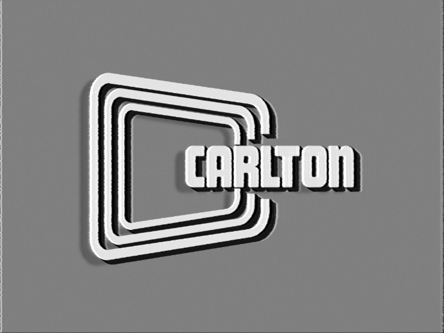
Originally a printing and photo processing company, they changed their name to Carlton Telecasting Ltd. soon after, and this was their first on-screen image. The C symbol, or 'screens' as remarked by some, stood for Carlton, but a popular theory was that Green was initially aiming for the Midlands, and "Carlton Central" was the working name.
Compared to their predecessor, Carlton's ident looked more Americanized (with the 3D shadows akin to that used by CBS back in early 50s), as well as more dynamic with the screen being drawn out individually, then projected with shadows that made it pop out.
Originally posted on DeviantArt in July 2023.
© 2024 West Knight | Not to be used in minting NFTs or training AI drawing models.
Comments & Critiques (0)
Preferred comment/critique type for this content: Any Kind


Leave a Comment
You must be logged in and have an Active account to leave a comment.
Please, login or sign up for an account.