@malvasia
Cristina Marsi

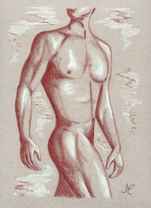
male torso
male torso by @malvasia (Cristina Marsi)

Just some practice on anatomy. Besides i wanted to try the effect of dark plus white pencils on coloured paper.

Category:
Rating:
Teen (N)
Class:
Finished Work
Submitted:
20y158d ago
Tags:
None
Other Work By @malvasia

Comments & Critiques (5)

Preferred comment/critique type for this content: Any Kind

Posted: Tuesday, 22 June, 2004 @ 09:22 AM

Very nice work. The anatomy is great in the arms and legs, but the chest could use some improvement. Where it twists around it looks too flat. It gives him an hourglass figure, he needs muscle definition there. I love the use of the white and red pencil crayons on the coloured paper. It really makes it look polished.

Posted: Tuesday, 22 June, 2004 @ 03:49 PM

raises brow, grins and points at guy How YOU DOIN! LOL, nice butt... seriously nice butt.. But realistically speaking, this is really amazing. I love it, very well done. I love male anatomy - a lot of people think women have the better anatomy... men are just as nice too :D

Very well done. He's lickable :D
Posted: Wednesday, 23 June, 2004 @ 11:23 AM

::grins:: My art teacher is always asking me to use colored paper to do sketches like this--yours actually inspires me, though! Yeah, male anatomy! :) I really like the white highlights, and the red is a very cool touch--it makes the halftone of the paper look very cool. I would only suggest adding a little more reflected light on the edges of the shadows... it's a confusing subject that I'm not qualified to lecture you on, so hopefully you understand what I mean, yes?

Excellent image.

Posted: Wednesday, 23 June, 2004 @ 03:01 PM

Hmmm, not really sure i understand about that reflected light... anyway this was my first try, i generally use just the sanguine pencil on plain white paper, which makes the effect far less interesting. I guess i still need to learn a lot about the light; thanks for stopping by and commenting though :)

Posted: Wednesday, 23 June, 2004 @ 04:09 PM

This is very good Cristina, but like my attempts at drawing a man it needs more practice. The abdomen needs more muscles defining, and the wrists look broken, as if they are bent in the wronk place.

Reflected light is softer, and in a coloured picture, it shows as a colour from another surface reflected onto another.

For example; Take and apple on a blue cloth. Some of the blue will be seen on the apple, and some of the apples red? reflected onto the blue cloth. Have a look at my colour tutorial that explains it a bit better. http://mysite.freeserve.com/soul_flowering

Leave a Comment

You must be logged in and have an Active account to leave a comment.
Please, login or sign up for an account.

What kind of comments is malvasia seeking for this piece?

  • Any Kind - Self-explanatory.
  • Casual Comments - Comments of a more social nature.
  • Light Critique - Comments containing constructive suggestions about this work.
  • Heavy Critique - A serious analysis of this work, with emphasis on identifying potential problem areas, good use of technique and skill, and suggestions for potentially improving the work.
Please keep in mind, critiques may highlight both positive and negative aspects of this work, but the main goal is to constructively help the artist to improve in their skills and execution. Be kind, considerate, and polite.