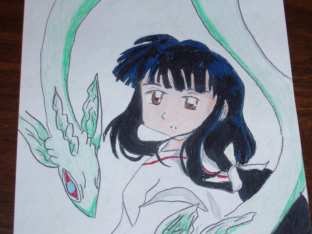
hehe, i can never get the eyes to look the same. it annoys me a lot, and as for the chin, it does look a little disproportionate but as i'm looking at the original copy, i think it's just because it got streched out a bit, and about the dragon, nothing to say cept i got lazy ^^'

Kikyou by @Takker (Katie Panagakis)
FINALLY! side7 hasn't been working for me for god knows why, but anyway, my dad bought a digital camera (we dont have a scanner so i took pics of my drawings and uploaded them)
it doesnt do the drawing justice. it looks a lot better IRL but i'm just happy that i got to upload it.
anyway, got this off a screenshot type thing and drew it. i messed up on her hair a little with the coloring and all that jazz. the shine isnt supposed to look that blue but anyway, here it is.
Category:
Rating:
Everyone
Class:
Finished Work
Submitted:
20y344d ago
Tags:
None


Nice drawing you have there. I like the flowing movement of her hair.
There are a few things, however, that really stick out for me. Kikyou's right eye is larger than the left one and also it's more slimmer than the left. Her chin doesn't line up too well with the placement of her nose, the chin is just shifted over too much. And with the dragon-type thing (ghost, soul-stealer thing?) around her, on Kikyou's left, that portion of the dragon thing's body is too sunken in. If you were trying to convey the notion that it's just curled about, you should have tried differently - ack, I can't exactly explain.
Otherwise, it's really nice. ^_^