OH MY GOD!! WHERE THE HELL DID U COME ACROSS SALAD FINGERS!? Very funny and yet most worrying..... if u come accross any more ... interesting animation please tell me lol.
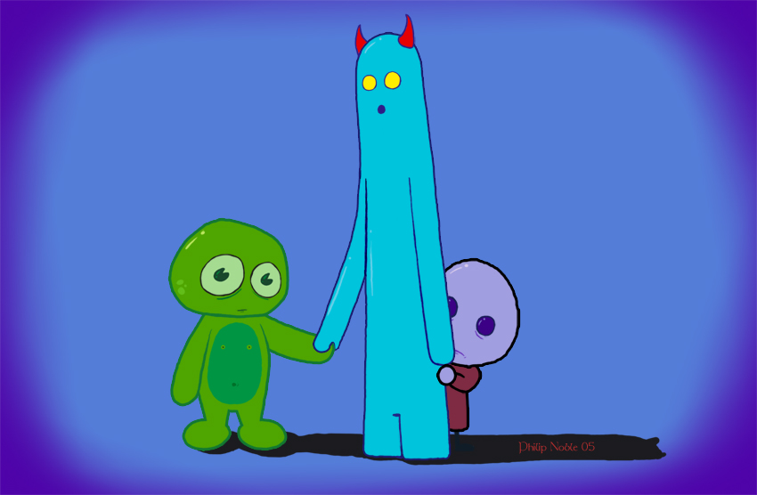
Thanx for the advice, I myself preffer the middle char but i hate drawing him.... its one of the reasons ive not dared to animate him yet. His got vertually everything wrong with him, Short stubby legs are a pain to animate walking, Long arms that wld have to sway with his movement all the bloody time and the horns that wld have to be moving in perspective when he turns and sways...... at least his face wld be easy ay?
U know i agree there is a problem with the hiding char, i dont think its because his 2 simple tho. its because his not been drawn very well at all. The Wide eyed girl that i made had a very simple face and yet it had everything it needed. If i could i wld reposition the eyes lower, give a stronger outline around them and fix his bloody head shape, but this picture had a deadline and i was working from left 2 right. U have to admit the shadow has a flux in perspective 2 but to hell with it, i have more pressing things to do.
Thanx again Mochi and chat ya l8ers
Munky


Out of the three I'd like the middle blue guy the most. The one hiding seems a but less 'original' because of the lack of special features? Just a tiny suggestion.
Good luck on the animation and make sure you show me the animations!!! XD
Do you watch salad fingers???? hehehehe