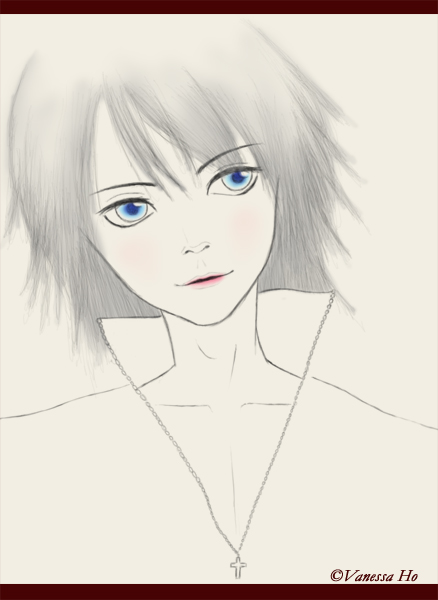
Thanks for the comment! Actually this was just a little sketch, no shading was actually added to the picture. It was meant to be a black and white (or grayscale) picture that has only the slight hint of blue and red in the places that I want to stand out ^^
But then again, as you have pointed out I probably should've added some shading under the chin regardless. So Thank you so much for your crit, it was very very helpful! Thanks! =D


Interesting expression. The shading looks pretty good. I like the mix of color and black and white. Is that the style you were going for? My only critique would be to perhaps maybe put some shading beneath the chin so that the head and body dont look so flat.