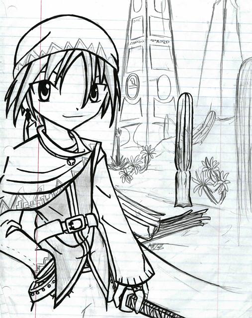
Very nice! I always love your lineart. =) I bet this could make it into Shonen Jump. It looks that good! I'm really loving the design of his costume. The little details here and there really complete the image. The bg is great too! It's good to see some perspective going on. ^^ Great job!

Mujika! by @Pop_a_doc (Matt Thompsonn)
Well, I tried to uplaod a picture of this character the other day, but, for some reason it messed up. So here he is again. Hows he look? He may not have made it inot hte pages of Shonen Jump, but I still like anyways. And, I decided to call him Mujika, after my first soildier in Final Fantasy tactics Advance. I really like him, and I even tried to do a backround for him, of course it sucks...but at least I tired. THe plants are just plants that you can find in just about anywhere I live, but, they suit this charecter...I dunno, I like it. I just need to fgure out what colors Im gonna color him...Id love to here if anyone has any ideas , or if you wanna color him for me X3 please feel free! (thoough I dont think anyone will wnat to :P) Oh, and If you have a suggestion for a better name, please tell me! Thanks! ^^


Very nice design! I really love his big eyes and the nice lineart you've done. It's great that you've tried a background--it looks awesome. The details like the plants and the design on his outfit really make this picture stand out as a great design. I am definetly looking forward to seeing it finished!