thanks! this was my first seriyos attempt at realistic painting, the advice is really helpful ^_^...

Category:
Rating:
Everyone
Class:
Finished Work
Submitted:
18y309d ago
Tags:
None
Comments & Critiques (7)
Preferred comment/critique type for this content: Any Kind
Posted: Monday, 23 January, 2006 @ 04:37 PM
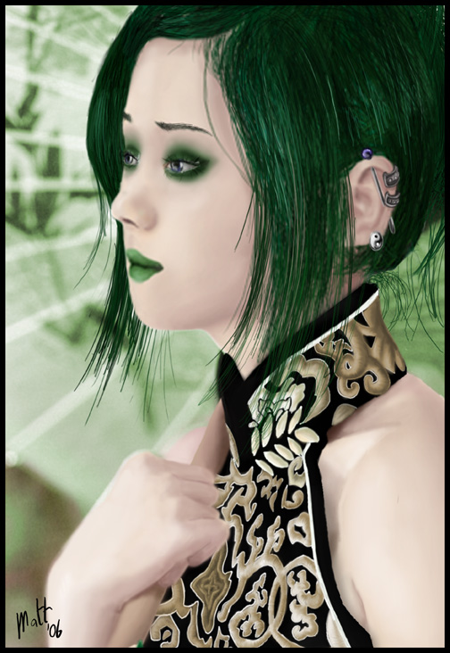
This is really amazing. It almost looks like a photograph, although you can still clearly see the character it's intended to be. I really like the subtle touches, like the green make-up and the earrings.
My only suggestion would be to darken the shadows on the skin. As it stands, it looks a little bit like an over-exposed photo with skin that white. However, this also works for an otherworldly feel, so it's not really a problem.


This is nice! Her dress is very detailed and challenging to make for sure. I love the details of her earrings and her green make up in realism makes it stunning. The hair is nicely done, although a tiny bit of smoothing out might be better, there the hair that sticks out from the back of her neck are too sharp in comparison with her overall hair. The best shading done to the hair would be the part on her right side, the relatively darker side. It shows blending but from the highlights shows detailed hair streaks. That's enough to portray some good realism in my point of view. The green hair in the front (as challenging as it already is) might've had a tiny bit exessive hair strands making it less natural.
The hand/body is very nicely coloured. It's soft but you can still see good shading. One tiny crit is the blending between the shirt and the body, a tiny bit more care in the erasing of the shirt can probably make the shirt blend in better, and maybe a tiny bit darker shade for the skin underneath the shirt like what you did to the neck?
Sorry for the long comment, I really love this piece, which is why I ended up blabbing lol Very nice, your realism art with a tablet is stunning! and I love Hao!!! hahahahahaha