@WHEATYEATSCHILDREN
Whitney Stephens

Aurora
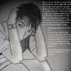
Aurora by @WHEATYEATSCHILDREN (Whitney Stephens)

Hmm, first upload = )

Well, I dont have a scanner at the moment. But...I have a digital camera, thats flash doesnt work.. So, it came out distorted, and I dont feel like messing with it. So Ta-da. Hope you like.
Category:
Rating:
Everyone
Class:
Undefined
Submitted:
20y123d ago
Tags:
None
Other Work By @WHEATYEATSCHILDREN

Comments & Critiques (1)

Preferred comment/critique type for this content: Any Kind

Posted: Saturday, 10 July, 2004 @ 02:19 AM

Nice picture. I like the minimal highlights in the hair, they give it a good shape - as does the drawing of it in general - and it's a nice effect. I like the pseudo-realistic style in this picture and the color scheme is very expressive. The curls on the right side of the picture are a nice touch, too. The bridge of the nose could be a little narrower, and her mouth is slightly off-center, but it's good work otherwise. Welcome to Side 7.

Leave a Comment

You must be logged in and have an Active account to leave a comment.
Please, login or sign up for an account.

What kind of comments is WHEATYEATSCHILDREN seeking for this piece?

  • Any Kind - Self-explanatory.
  • Casual Comments - Comments of a more social nature.
  • Light Critique - Comments containing constructive suggestions about this work.
  • Heavy Critique - A serious analysis of this work, with emphasis on identifying potential problem areas, good use of technique and skill, and suggestions for potentially improving the work.
Please keep in mind, critiques may highlight both positive and negative aspects of this work, but the main goal is to constructively help the artist to improve in their skills and execution. Be kind, considerate, and polite.