Thanks for the comment!

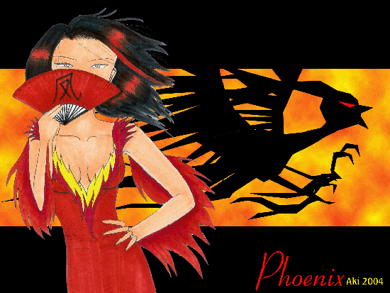
Phoenix Lady by @boredslacker (Aki Tan)
Don't think that it's as nice as Dragon Lady, but it's meant to be a companion piece to it. Phoenix Lady ushers in the New Year, burning the ashes of the old so that a new one may arise.
Phoenix lady done in pen ink copic while the rest is in PS.
Comments & Critiques (6)
Preferred comment/critique type for this content: Any Kind
Ooh, this has a really nice design--the layout of the image is really cool and creative--it reminds me of the snapshots they show during anime before the commercial breaks. I love the background--the way you have the phoenix looking like a paper-cut out is way cool. I also am impressed with how well you blended the real media (Copics! I hearts them!) with the Photoshop in the background.
However, your copic coloring doesn't turn out quite as smooth as it does for me, which leads me to ask, what kind of paper are you using? Copics look best on fine quality paper, like Smooth bristol, although in a pinch cardstock will do (although it can give a slight grayish cast to the coloring). I notice this mostly in her dress. Her hair is amazing, by the way--I love the way you've done the red highlights. It seems to suit this type of character very well! I think that her eyes should be orange, though. I am not sure why, but I think that would blend her with the background a bit more and still lend her the air of intensity that she deserves.
Keep up the great work in 2005! I will look forward to it, as always.
I do my pics on a regular sketchbook, so it's that art paper material, that's slightly stiffer than regular paper? Donno the name for it, sorry... :p And it's not too smooth in areas, ( esp the skin... gomen... ) because I use the markers for too long and then the colour runs out. Bleah. Either that or the colour in some of them ( Esp my skin colour one ) is starting to run out.... Noooo........
As per the eyes.... on a sudden whim, I painted them purple. I donno why either. Hahaha....
I like the concept behind this image! Very nice.
It's interesting how you used nearly all straight lines for the Phoenix in the background. It's not something I would have thought of, but I like it a lot. It gives it a modern look to something quite ancient.
The texture/highlights of red in her hair are pretty kewl, and I like the flame like pieces on her dress. The hands are simple, but impressive. cannot draw hands to save her life Though . . . I'm not really sure if anyone holds a fan like that. But hey, it's all good!


I like this one too...but the other I think has a nicer face..would be nice to see her actually laying on her belly, kicking up her feet just an idea! Kool color...