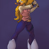
Comprimise by @emilylorange (Shannon Fowler)
If you say it's cute, I'll know you're not really looking at it, and you didn't read this.
Despite errors (one of which I noticed while writing this and am correcting...), this is actually a lot closer to how I invision the characters, as opposed to how Disney does... haha... I especially like how no line in this could stand up to the scrutiny of a straight edge.
Drawn completly from beginning to end with my tablet. The most fun part was throwing random colors into the background (and I learned how to draw a floresant light).
My thoughts on a Wing/Mal relationship.
Wildwing and Mallory are © Disney


LAWLS IT'S CUTE.
cringe :D
No, I think it's awesome. I didn't watch enough of the cartoon to do more than recognise that they're characters from it. (Actually, I might not even be able to tell they were official characters - just I'd be able to tell the fandom.) - So I can't tell you anything about my opinions on their relationship or how you captured it.
I can, however, speak about character interaction, of which there is and well-done at that. It seems like she has him off-balance (based on his expression and the physical positioning of his body) and she's comfortable and not-gloaty about it.
I'm not entirely sure that they fit with the background. If they were shaded with blue or purple, I think it might help. But it's not like the.. unsettled sort of feeling I get when someone posts very cartoony characters over a highly detailed photograph. So they're not entirely out of place, just slightly out of it. flail verbally Eh - it looks like an animation cel, which is good, no? :D
Speaking of the backgroung: omg, so awesome! I believe I'm jealous. XD
Thanks so much for sharing it. :3 It's awesome.