Thanks! :D It's neat when you mix metal and clothing because most clothing doesn't have shiny highlights, but the metal does, so it's a nice contrast! Yeah, all the pink is a bit darker and more red than the original, so perhaps that made the blushies look awkward. Her design actually has those blushies! Though I also shaded the one behind her staff (seemed a realistic effect... ^^;;;;;)... Hopefully, Red and I will work together on pictures more!

Thank You Gift for Li-Chan by @smarle (Staci/Nadia)
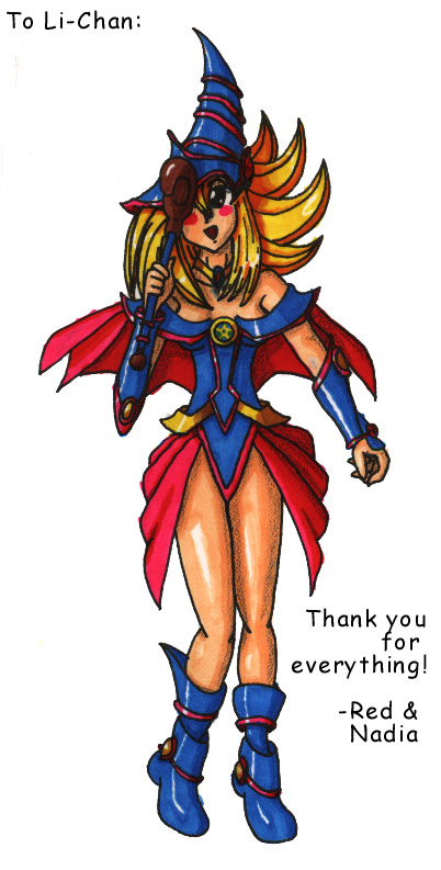
This is a collaboration gift I made with Red Leader for Li-chan! Yes, I know it was finished two months ago, and that Red already has it up in his gallery, but I'm finally not being lazy and putting it up here so I can put in my comments about the picture... ^^;;;;
Red and I were both thinking of drawing Li a gift for her kindness in offering us a scanner. We both came up with the same idea (the Black Magician Girl from Yu-Gi-Oh!), so we decided to do a collaboration picture! I'd always wanted to do a collaboration with Red... He drew and I colored. He finished the lineart pretty quickly, and actually, my coloring didn't take all that long, either. Red's lineart was pretty and really detailed!
I think the coloring turned out pretty well. The only problem I had was leaving enough white space for highlights, particularly in the thin or small areas... I wish I had one of those white pens/markers that puts white over anything--things would've been so much easier... ^^;;; For the shading, I tried to follow the advice of one of my friends' old marker tutorial and layered different colors on top of each other as opposed to just darkening the base color for some of the colors. I think that gave a good effect, especially in the gold and pink areas. I also lightly ran a black pencil over the darkest shading. I like how that turned out on the skin the most... I did mess up in a few places, like I ignored the space where her hair shows through the hat and made it blue as well. And I think I was rushing a little too much near the end... I don't know how much that shows, though...
Sadly, the picture scanned rather darkly. We hadn't yet figured out how to brighten scanned images... ^^;; A lot of the lineart details were lost in the particularly darkened shadowed areas... ^^; But I still like how it all turned out! I'm glad you liked it as well, Li-chan! ^-^
Comments & Critiques (3)
Preferred comment/critique type for this content: Any Kind
Seriously, like I mentioned in Red's comments for the very same picture, you two should seriously work together on more projects! You both do some great work and, with your talents combined, I really think that you two can make some truly excellent artwork! I think this is one of your best pictures, respectively! :D
Anyway, I can't think of that much more to say about this picture. The pose is wonderful (good job, Red!!), and the original source material was excellent. HOwever, I think this is one of your best attempts at coloring a picture, Nadia. Despite the fact that it turned out a bit dark, it's not that big of a problem, if it is a problem at all!
Seriously, you and Red should really work together more. Bravo!! ^_^


Way to go, guys! You two work well together. Red, great work on the clothes. ^^ Nadia, your colors are vibrant and eye-catching....great job on varying the amounts of highlights on different surfaces. My only complaint would be the blushies -- they look a bit odd, possibly from the dark color -- but that's a tiny nitpick in an overall lovely image. ^^ Cute cute cute!