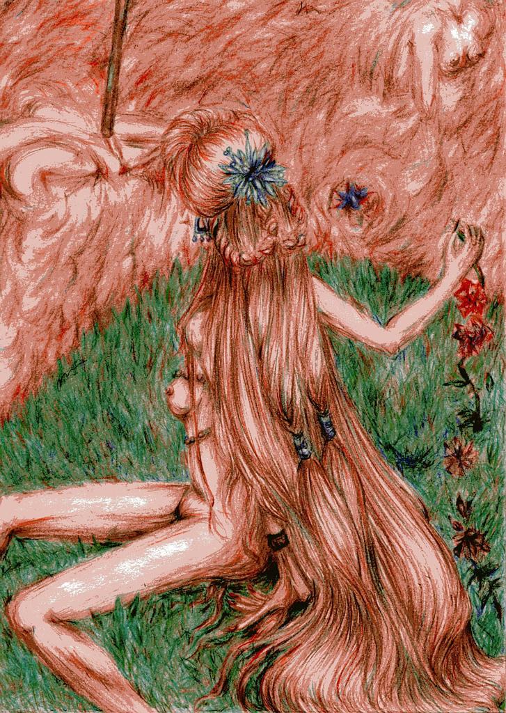
I think this turned out pretty darned good. I like how the red gives it such a bloody, gory feel--but her hair does blend into the sea of blood a little too much. The green is such a striking contrast, it really does put a sense of discord in this image--but that is GOOD, since it is meant to be a distrubing image.
Here's the issue on perspective--the background and the way the character are sitting don't add up. You see, you have the character posed as if she would be sitting on or near the horizon line, but in the background, we can't even see the horizon line, because it's supposed to be more of an arial view. The only way I could think of to fix this would be to change the pose somewhat, so it's more looking down on her (you'd see less back, just the bottoms of her legs, and the top of her head and arms) to show off the background.
Good luck with your next works, I hope you figure out all your perspective needs soon! And I hope I do, too, cause I am not that good at actually drawing it!


I Came back to see the finish and it looks great........Shirley