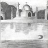
I really hate that show too! Its so stupid, not one thing on it that Ive seen has been funny! Anyways, this is a really cool picture, I especialy like the ravens eye. I agree with malvasia though, the colors on this are kinda bland. It would look alot better if you added some shading, especialy to the ground. also, I think it would look alot better in colored pencils instead of crayons, but thats just me. Aside from that, this is really good, and the bird looks really cool.

Vulture/Raven in Graveyard by @sprite_remix (skasnotdead16)
"That's so Raven it's the future I can see..." jk guys I hate that show. Anyways after drawing my eagle in art I drew this because I think I can draw birds somewhat good. Comments?
Category:
Rating:
Everyone
Class:
Finished Work
Submitted:
20y220d ago
Tags:
None


I like the drawing and the composition, but you should be more daring with the colouring. Add shadows, expecially to the ground and the raven on the foreground; and try to smooth a bit your crayon strokes so that they are not visible anymore as lines. I guess the line in the middle is scanner's fault. Alas i have no advice about it, it happened to me too. I'm solving it pressing hard with my hand on scanner cover while scanning... not sure if it is same problem with your though.