

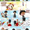
I like this image. It's rather anime style, but it has a rough sense of realism to it--I think because of the way the details, like the clothes and hair, are rendered. Keeping the sketchy lines is a great idea in this piece--it gives this image a gritty, realistic feel. I really like that.
Now, the pose is good, but the way (you're) holding your head seems wrong. I mean, it seems like you're kind of hunching your shoulders up--which works fine, but it doesn't seem to suit the way your back is straight. If the back was curved a little more, it would seem more like you were actually hunching your shoulders up in a way that people (including me, at times) do when they don't really want to be noticed.
This is a really small thing. O.o So I might be the only one who notices it. Another way you could fix this is by lengthening your neck--but overall, it doesn't really NEED fixing. It still works. It's just ambiguous.
I would work on hands, more. The hands you have now look like you kind of sketched them in without trying too hard. Hands are a pain to draw, though. A necessary evil. ::sighs:: The other suggestion I have is to add more shading to the skin--in the face. I usually add a little shading around the nose and lips in my anime-style drawings, but sometimes it can be tough to place where exactly you want to put it. I notice you have a little shading by the nose, but the face seems like it needs more--like it's a little flat.
Geez. My critique sounds harsh. I'm sorry. Because this is a really great picture, and I like it a lot, I am a little picky about details I'm picking out. I mean, you can definetly look at this pic and not notice anything amiss because there isn't really anything amiss. It could just get better. Or something. Okay, not making sense. Gonna stop. :)
And I LOVE THE HAT! that's a totally sweet outfit.
i don't know what to say, but that i like it. and that's a cute jacket. is that real? if it is, where'd you buy it, i've been trying to find something like that.