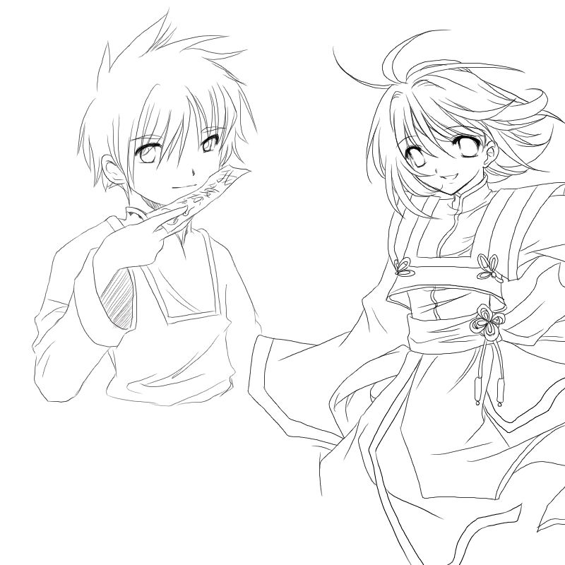
lol I was going to see what you were talking about with the hand thing, and the thing is that his thumb isn't in the picture. Those are his two fingers, the pointer and middle. His thumb is not in there ^^;

Another Collab by @Egg (Egg Kaufman)
hehehe~ Yay another collab w/ Meng chan ^^ it's easy to do since we're in the same Animation's class together. Unfortunatley we seem to be doing less and less.. lol our other one wasn't all the way colored, and this one isn't colored at all XDD go us lol..
Category:
Rating:
Everyone
Class:
Finished Work
Submitted:
20y274d ago
Tags:
None
Comments & Critiques (4)
Preferred comment/critique type for this content: Any Kind
Posted: Sunday, 29 February, 2004 @ 07:54 PM
Ah, it seems I let my phrasing obscure what I wanted to say....
The two fingers look shorter than they should be. That is the only critique. At first glance it looked like you forgot the tumb, but I concede that in that pose, the thumb could be completely obscured. (That was the 'awkard posing' of trying to view my own hand at that angle.)


Very nice. Very authentic looking. The hair and fabric really seem to flow. Guess that animation class is well worth it. The only aspect of the drawing that looks even remokely funky is the hand. The fingers seem like they should be a little longer and...poses hand akwardly...okay, the thumb can be completely hidden in that position.
Still. Very nice, very clean.