Thanks! I'm really proud of how his expression came out. In color, this will be a very bloody pic....

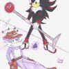
They Tried to Kill Me! by @Lucky_Ladybug66 (Daisy Hunt)
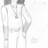
From Lead Me Through the Fire, a new YGO fic I'm working on. Duke barely escaped a car bomb and is experiencing a moment of stunned shock (which quickly dissolves to anger).
You will notice a more realistic look, especially with the eyes and the hair; the "triangles" will be illustrated by me as heavy waves, something I did more or less with the Orichalcos Duke pictures. But I'm sure you agree I've improved with my art since then. XD;
Category:
Rating:
Teen ()
Class:
Work-In-Progress
Submitted:
15y45d ago
Tags:
None
Comments & Critiques (6)
Preferred comment/critique type for this content: Any Kind
Posted: Wednesday, 14 October, 2009 @ 10:55 PM
I would agree that you've improved since then. XD And I think I like that hair better than his canon hair...this hair looks like it could actually move in a strong wind.
Your anatomy's improved so much in the past couple of years...I still always make arms look like noodles if I don't draw clothing on top of them. I have to point out, though...with the hand against the wall, the lowest joint of them thumb should be lower, and come out from the hand at more of an angle...otherwise it comes across as five fingers and no thumb. Also...I'm not sure how to put this without sounding unintentionally perverted, but hs crotch looks kind of two-dimensional. I don't mean "make it bigger" or anything like that, heavens no, but you're doing so well on upper-body stuff it seems a shame not to help with the lower-body...and he sort of looks like he's lacking a pelvis. I think if you had more of a definite form where his legs join his hips, and curved the line of the inseam a little, maybe added a little definition to his hips, it'd make a huge difference in giving the figure a three-dimensional feel.
I'm really impressed with the battle-damage you added to his clothing, especially the patch on his knee...that's a really nice rip! And I love the way the collar of his vest is hanging, and the edge of his not-sleeve...the whole vest looks really three-dimensional.
His expression is so, so appropriate, and his ear! I'm having issues with ears, and that one's positioned great. I'm jealous! And I really love the part in his hair...it's in a great spot, and makes all of his hair look that much more realistic.
Posted: Thursday, 15 October, 2009 @ 01:20 AM
Figuring out how to draw YGO characters with realistic hair is definitely an interesting challenge. XD The waves are fun to do.
Thanks for the hand tips! I knew something didn't look quite right there.
And thanks for the other tips too. XD I've been thinking I need to try something like that.... I have a couple of pictures where I kind of have, but I can't recall if I've ever posted them....
Ears have definitely been issues for me in the past. I'm glad I'm getting better with them! And I wasn't sure how well I did with the ripped clothes, so this is definitely encouraging! I really am proud of the vest, in any case.
(And on a totally other note ... exactly why did Side7 get rid of the ratings reasons on this and the succeeding pics? XD; I even went in to the edit page in case it turned them off, but they were still checked. And yet it won't show them ever since I edited for some other reason....)
Posted: Thursday, 15 October, 2009 @ 04:10 AM
[quote="Lucky_Ladybug66"](And on a totally other note ... exactly why did Side7 get rid of the ratings reasons on this and the succeeding pics? XD; I even went in to the edit page in case it turned them off, but they were still checked. And yet it won't show them ever since I edited for some other reason....)[/quote]
How do you mean? I see a T in the image description...was there more to it than that? o.o;
...and in an unrelated note, I asked about the account credit stuff in the forum, but nobody got back to me yet...but I think we get one credit per comment now, regardless of the comment, and they're going to bring back the comment-rating in version 4.1, but it'll be set up differently.
Poor Duke! He looks so devastated. ;_;
I really like how he came out! The expression is perfect, and the clothes and hair look great! ^^