@Digi
Digi Otes

Revamp
Revamp by @Digi (Digi Otes)

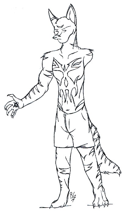
Just because I needed a design sheet for him. I like a set design for stripes, call me odd.

Sort've a revamp of my warlock character, Doujin. The pattern on his chest is...new, and spur-of-the-picture, but I like it all the same. He also got a buzz-cut-ish-thing. griiiin Hoo-hah.

Lesse, lesse...uh...he's got a mini-orb in his right hand(for those who thought it was a sribble ^^), and, well, my only complaint is that his legs seem a little...short. I don't know, it could just be the shorts/boxers I put on him, but...eh...'m picky.
Category:
Rating:
Everyone
Class:
Work-In-Progress
Submitted:
20y174d ago
Tags:
None
Other Work By @Digi

Comments & Critiques (1)

Preferred comment/critique type for this content: Any Kind

Posted: Saturday, 05 June, 2004 @ 09:10 PM

As a whole, the body length is fine. The problem is that the torso is too long compared to the legs. Nicely drawn otherwise, though. I like the pattern on his chest.

Leave a Comment

You must be logged in and have an Active account to leave a comment.
Please, login or sign up for an account.

What kind of comments is Digi seeking for this piece?

  • Any Kind - Self-explanatory.
  • Casual Comments - Comments of a more social nature.
  • Light Critique - Comments containing constructive suggestions about this work.
  • Heavy Critique - A serious analysis of this work, with emphasis on identifying potential problem areas, good use of technique and skill, and suggestions for potentially improving the work.
Please keep in mind, critiques may highlight both positive and negative aspects of this work, but the main goal is to constructively help the artist to improve in their skills and execution. Be kind, considerate, and polite.