@wolverine
Rhiannon o' Forest

Graphic Design
Graphic Design by @wolverine (Rhiannon o' Forest)

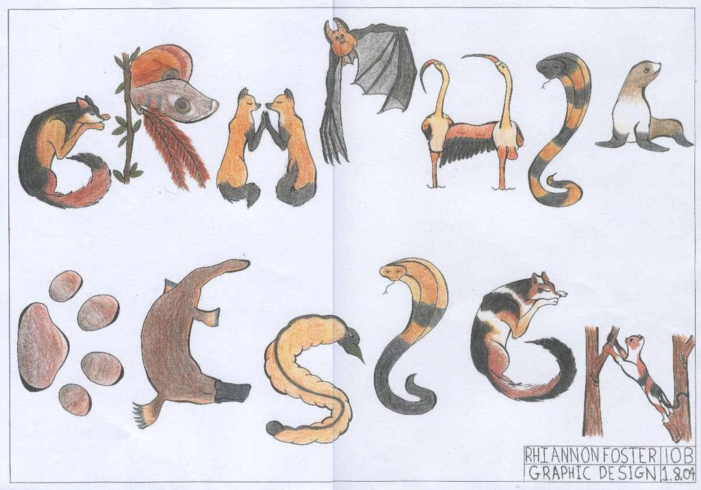
This is GRAPHIC DESIGN written in animal-letters. Can you see it?

There's a slash of purple paint across the 'R' moth, from where someone stupidly got purple paint on it when it was inside the cupboard with all the other finished pieces!!!! pant pant Yes.. mad about that Anyway, there's that, and the colour is very dull compared to the real piece. This scanned one is also a photocopy, so it's doubly 'dulled'. (I ahd to put white-out on the original and have it photocopied so it wouldn't show up where there was purple paint on other spots.) I'm going to also upload the lineart (tomorrow, I'm out of uploads today!) because the colouring hides some of it, and I really liked several places. The wing in the 'H' was my absolute favourite bit, but unfortunately the black hides it all. Anyway, I'm going to stop chattering now.
Category:
Rating:
Everyone
Class:
Finished Work
Submitted:
20y96d ago
Tags:
None
Other Work By @wolverine

Comments & Critiques (1)

Preferred comment/critique type for this content: Any Kind

Posted: Monday, 20 September, 2004 @ 09:10 AM

LOVE IT!!! and greatidea too!^^

Leave a Comment

You must be logged in and have an Active account to leave a comment.
Please, login or sign up for an account.

What kind of comments is wolverine seeking for this piece?

  • Any Kind - Self-explanatory.
  • Casual Comments - Comments of a more social nature.
  • Light Critique - Comments containing constructive suggestions about this work.
  • Heavy Critique - A serious analysis of this work, with emphasis on identifying potential problem areas, good use of technique and skill, and suggestions for potentially improving the work.
Please keep in mind, critiques may highlight both positive and negative aspects of this work, but the main goal is to constructively help the artist to improve in their skills and execution. Be kind, considerate, and polite.