@RSnurkle
R.E. Snurkle

SP11
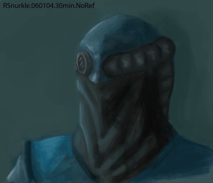
SP11 by @RSnurkle (R.E. Snurkle)

Speed Paint

Was working with a character I created in a concept design exercise, named him O'Walcen. There are several things I'm not happy about with the design, and I don't like parts of this picture. So ... yay. ><

I fear I am regressing.

Category:
Rating:
Everyone
Class:
Undefined
Submitted:
20y171d ago
Tags:
None
Other Work By @RSnurkle

Comments & Critiques (2)

Preferred comment/critique type for this content: Any Kind

Posted: Wednesday, 09 June, 2004 @ 08:02 PM

This guy's pretty cool: the design reminds me of (now this is weird) Mortal Kombat, Raziel (from Soul Reaver), and a Haz-Mat suit.

If you feel you're in a rut...maybe start off with a b/w/grey line drawing with shading, then throw the color over; that'll give things like his tube more form, and maybe help you ... feel more contrast? ...(blink)

...

Or maybe start working with more drastic color differences: you're like me, you like to stick to kinda monochromatic schemes (blue-bluegreen-grey) ... maybe throwing in an accent complementary color will help.

Posted: Thursday, 10 June, 2004 @ 01:37 PM

Heh, I'm glad the design is a mix. I've actually never played Mortal Kombat or Soul Reaver though. =(

I've considered the b/w line, or shaded stuff before, but I'm just not as interested by it somehow or something. That may be a part of my brain being silly or something.

But purposely sticking a complement in there, and having to deal with it sounds like it might be helpful. I've been thinking about complements and how to use them lately, but I think I get them too muted if I put them in at all. Thanks for the suggestion!
Leave a Comment

You must be logged in and have an Active account to leave a comment.
Please, login or sign up for an account.

What kind of comments is RSnurkle seeking for this piece?

  • Any Kind - Self-explanatory.
  • Casual Comments - Comments of a more social nature.
  • Light Critique - Comments containing constructive suggestions about this work.
  • Heavy Critique - A serious analysis of this work, with emphasis on identifying potential problem areas, good use of technique and skill, and suggestions for potentially improving the work.
Please keep in mind, critiques may highlight both positive and negative aspects of this work, but the main goal is to constructively help the artist to improve in their skills and execution. Be kind, considerate, and polite.