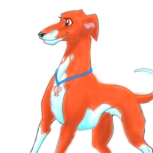
Thanks a lot! ^_^ My personal char is a Whippie =)
Yes, sigh I hear that a lot in art class too... "You need to add more contrast!" Oh well, my own fault for not heeding it. Thanks for the great advice (and the colouring tutorial), I'll be sure to take it!


Heh, cute face and design! Is she a greyhound, or a whippet?
I like that you're using complimentary colors here--orange and blue--and that you used blue to shade--makes it MUCH more livelier (though--why not some blue shading in the whites of her eyes?).
Some suggestions for next time:
Right now her colors are supervibrant--which is good if you're going for a cartoon-type feel (which I see working for this character!)--but if you want them a tad more realistic, add some blue (just a touch) into your orange; this will make it a little more of a calmer color. (I have a color-picking tutorial at my site, talanyn.com , under the Caterpillar Box, if you're interested.)
Also, don't be afraid to pump up your shadow colors. I can see you're trying to show the darker parts, but go ahead and let 'em jump out more. It'll give her more dimension.
Finally, if you want colors, but don't want your linework blurry, use Painter's Watercolor Tool; it'll go right over your linework without bothering it. And it's a quick and easy way to fill in a background color too, instead of putting her on purewhite.
Keep up the nice work!